Plasma/Pager: Difference between revisions
No edit summary |
No edit summary |
||
| (5 intermediate revisions by 3 users not shown) | |||
| Line 4: | Line 4: | ||
<!--T:13--> | <!--T:13--> | ||
<p></p> | <p></p> | ||
[[Image:Plasma_pager_widget.png |thumb| | [[Image:Plasma_pager_widget.png|thumb|190px|center|Plasma Pager Widget]] | ||
<!--T:1--> | <!--T:1--> | ||
| Line 20: | Line 20: | ||
<!--T:6--> | <!--T:6--> | ||
[[ | [[Image:Plasma_pager_general.png|512px]] | ||
<br clear=all> | <br clear=all> | ||
Under general settings you can configure the following options | Under general settings you can configure the following options | ||
Latest revision as of 21:45, 30 November 2018

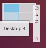
The desktop pager is a plasma widget that helps you to organize virtual desktops. It gives a small preview of each virtual desktop which consists of rectangles which represent the geometry of the applications on this virtual desktop. You can switch between the virtual desktops by clicking onto the previews. Hovering over the previews a list of all applications on this desktop is displayed. Via the context (right click) menu new virtual desktops can be added or the last virtual desktop can be removed.
Furthermore the desktop pager determines the arrangement of the virtual desktops (e.g. 2x2, 1x4, 3x4, etc.). This arrangement has an influence on the switch desktop animation.
Configuration
The desktop pager provides a wide variety of configuration options which can be accessed through the context menu. Right-click on the pager and select .
General

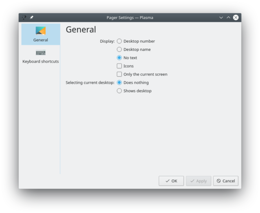
Under general settings you can configure the following options
- Desktop number, Desktop name or no text at all
- Toggles whether application icons are shown in the preview
- Sets what happens if the preview of the current active desktop is clicked:
- Does nothing
- Shows desktop
- Shows dashboard

