Projects/Usability/HIG/Layout/Image: Difference between revisions
m (Andrew moved page User:Andrew/Layout/Image to Projects/Usability/HIG/Layout/Image: Review complete) |
|||
| (2 intermediate revisions by the same user not shown) | |||
| Line 7: | Line 7: | ||
* Ensure images have the appropriate resolution for their containers. Try to not scale images up beyond their native resolution - the result will be fuzzy or pixelated. | * Ensure images have the appropriate resolution for their containers. Try to not scale images up beyond their native resolution - the result will be fuzzy or pixelated. | ||
* Don't be afraid of larger image sizes. Images are most effective when they can be seen. Tiny images lose much of their meaning (unless they are specifically crafted for small sizes). | * Don't be afraid of larger image sizes. Images are most effective when they can be seen. Tiny images lose much of their meaning (unless they are specifically crafted for small sizes). | ||
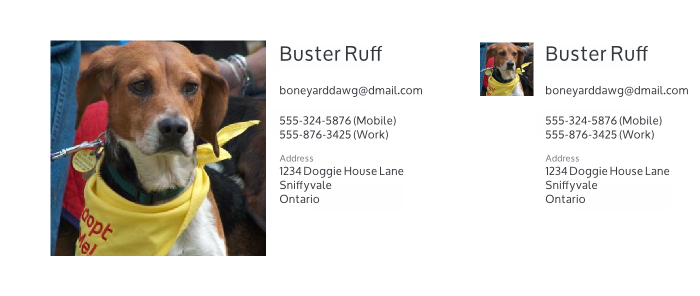
* For example, consider a large contact photo (left) instead of a tiny thumbnail image (right). People recognize faces faster than names. | |||
[[File:ImageSIze1.png]] | |||
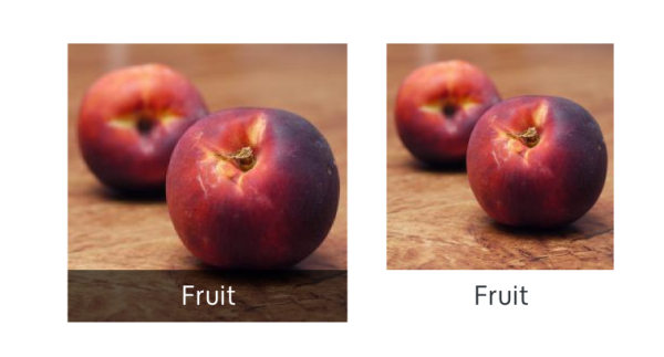
* Captions can be placed on the image (left) instead of outside of the image (right) allowing the image to be larger and the content to be more immersive. | * Captions can be placed on the image (left) instead of outside of the image (right) allowing the image to be larger and the content to be more immersive. | ||
Latest revision as of 16:36, 27 July 2014
Purpose
Images can convey meaning and emotion. Preserving these characteristics is the primary focus of this guideline.
Guidelines
- Ensure images have the appropriate resolution for their containers. Try to not scale images up beyond their native resolution - the result will be fuzzy or pixelated.
- Don't be afraid of larger image sizes. Images are most effective when they can be seen. Tiny images lose much of their meaning (unless they are specifically crafted for small sizes).
- For example, consider a large contact photo (left) instead of a tiny thumbnail image (right). People recognize faces faster than names.
- Captions can be placed on the image (left) instead of outside of the image (right) allowing the image to be larger and the content to be more immersive.
- Use a semi-transparent background behind the caption text to preserve contrast for legibility.
- Try to preserve the image aspect ratio. If preserving the aspect ratio is a challenge, consider cropping the image to fill the container instead.


