Showfoto/Curves Adjust/bg
Фото KDE Урок 1-2 - Настройки с Curves
Унай Гаро (uga) - Лято 2008
Това е втората част от уроци, имащи за цел да ви запознаят с инструментите на "KDE" (а именно ShowFoto и/или Krita), за обработка на изображения. Първата част ви запозна с боравенето с хистограма и цветови нива. Този урок ще ви покаже как да ползвате един по- сложен и мощен инструмент- Curves Adjust. Като по- усъвършенстван, боравенето с този инструмент изисква търпение и натрупване на практика, за да бъдат постигнати добри резултати.
Нека започнем. За този урок ще боравим с дадената по- долу снимка, любезно предоставена от Джос ван дер Оевер.
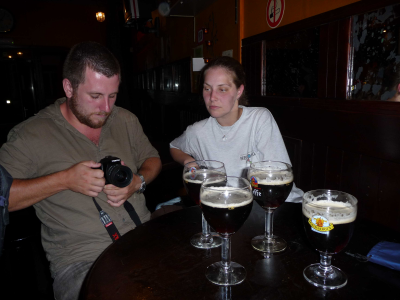
The problem in this photo again, is that there are parts of the image that are very dark. The two people are clear in the photo, but the background is so dark that we cannot actually see the pub's details. Let's see what happens if we try using the levels tool, as we learnt in the first tutorial:
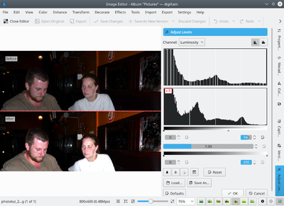
As you can see, some parts of the image get blown if we try using the levels tool. What does that mean? It means that we have parts of the image in the right hand of the histogram that have been all converted to white. That's because, unlike the previous tutorial, this image is not concentrated on the left part of the histogram. It covers the whole of it. And when clipping the histogram with the input sliders, we are "eating" part of the information.
Why does this happen? Because the photo scenario had a very High Dynamic Range. i.e. it had objects from very dark (background) to very bright (illuminated by flash).
In this sort of images, if we try moving the input sliders of the levels tool, we will delete part of the photo's gray level information, losing details, and the result isn't nice.
So what to do now? We can use the from the menu : ![]()
Selecting this option will show a new popup with a dialog that may look similar to the levels tool. You can see the resulting histogram on top, and the input histogram on the bottom, just like in the levels tool:
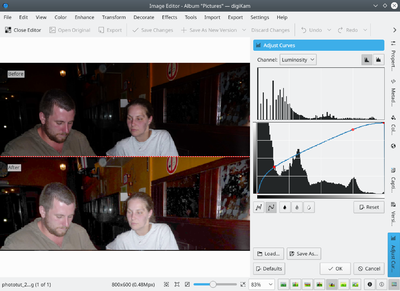
The difference is in the way the control works. In this tool, the input histogram has a diagonal line in it. Clicking on it with the left button of the mouse, adds control points. You can move those control points up or down. The result, as shown in the picture above, is that the gray levels from the horizontal axis are converted into the gray levels in the vertical axis.
Moving the control points up, makes that part of the image brighter. Moving them down, makes that part of the image darker.
In this case, I wanted to make the darkest parts of the image brighter, so I added a control point on the left part of the histogram, and moved the point upwards. As the rest of the image was also getting a bit too bright, I added a second control point to avoid it.
So, lets press and see what we get of it:
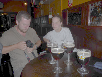
We have managed to make the shadows brighter, and now the pub is more visible, but the image is now a bit washed out. As if it were too bright all over the place. Can we do something? Sure, lets try the levels adjustment again:
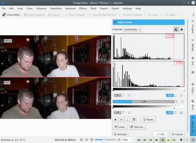
Now that the shadows were adjusted using the curves, and the colors are more uniform, we can follow the method shown in the first tutorial and adjust the levels of the photo, as shown above. The histogram's main data was a bit displaced to the left, and adjusting levels, I made it cover the whole range again.
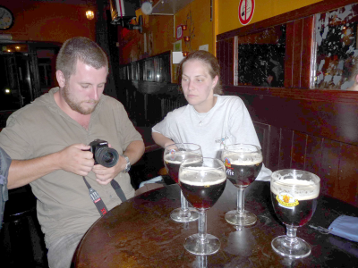
Lets see the result - Ah, now this is much better. The pub background is much more visible and the two persons are not blown:
I think that's already acceptable, but if we are picky, the two people are a bit washed out due to the flash light. So, even if that goes out of the scope of this tutorial (it'll be covered in the following tutorials), lets adjust a bit the saturation and contrast in the image for a better result:
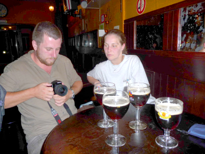
Now this image looks much nicer than the original, yes. I hope you liked this tutorial and will see you in the next one!

