User:Andrew/VisualDesignGuidelines: Difference between revisions
No edit summary |
No edit summary |
||
| Line 1: | Line 1: | ||
{{Construction}} | {{Construction}} | ||
{{Note|The content here is subject to change. Additionally, this guide will be continuously integrated into the [http://techbase.kde.org/Projects/Usability/HIG | {{Note|The content here is subject to change. Additionally, this guide will be continuously integrated into the HIG ([http://techbase.kde.org/Projects/Usability/HIG) over time.}} | ||
This is the Visual Design Guide for KDE Applications and Workspaces. | This is the Visual Design Guide for KDE Applications and Workspaces. | ||
Revision as of 18:58, 17 March 2014
This is the Visual Design Guide for KDE Applications and Workspaces.
Overview
Design Vision
The future that never was; clean, technical, but human.
The design vision is focused on two attributes that connect the KDE community's past to it's future.
- Capable - Power and flexibility. KDE Applications and Workspaces allow users to be effortlessly creative and efficiently productive.
- Human - Simple and inviting. KDE Applications and Workspaces are pleasant to experience and easy to use.
Design Principles
The design principles are guideposts to reference in support of the Design Vision.
Capable
- Solve a problem Identify and make very clear to the user what need is addressed and how.
- Always in control The user should never feel at the mercy of the tool. It should always be clear what can happen, what is happening and what happened. Give the user the final say.
- Be flexible Provide sensible defaults but consider optional functionality or customizations that do not hinder the primary task.
Human
- Make it easy to focus on what matters Remove or minimize elements not crucial to the primary task. Use spacing to keep things uncluttered. Use color to draw attention.
- Make important things fast Not all actions are equal. Make important information or functions easy to find and use, like the pause button on a music player.
- I know how to do that! Make things easier to learn by reusing design patterns from other applications.
- Do the heavy lifting for me Make complex tasks simple. Make novices feel like experts.
Style
A set of essential style elements should provide a palette with which application designers can express their own unique vision while also being part of a shared, community vision.
Color
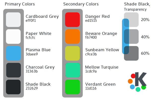
- Primary colors are used throughout the main interface of the applications and workspaces. Plasma Blue is used as the primary highlight color.
- Secondary colors are used sparingly as accents throughout the visual design.
- Where transparency is used (e.g. shadows) consider using the opacities listed.
Backgrounds and edges
The background is intended to approximate the look of high quality paper (e.g. card stock). For Plasma Workspace elements, the background is (barely) translucent. For applications the background is fully opaque. The general background color is Cardboard Grey.
For more information-dense content areas (whether in plasmoids or applications) Paper White can be used for improved readability. These might include longer lists, tables, large blocks of text documents, charts,etc.
Edges are sharp and distinct. Corners are sharp but non-threatening; about a 2 or 3 pixel corner radius.
Spacing and Padding
Create breathing room. Visual elements are spaced a minimum distance from each other and edges. Spacing (and/or color) is used to group or separate elements.
- A 4px grid is recommended for spacing and padding of visual elements.
- Multiples of 4 px (8px, 16px, etc.) is used where more spacing is required.
- "8px" is the minimum recommended padding inside elements (buttons, groups, text fields, etc.)
Alignment
Visual elements are consistently aligned both vertically and horizontally.
Icons
Monochrome icons:
- Can be used for application toolbar actions, menus and status and notifications.
- Rely on a distinct shapes instead of fine details to distinguish between them.
Application icons:
- Unique and easily recognizable
- Respect trademarks by avoiding significant alterations to other application icons
Other icons:
- Icons of a similar type use a consistent visual language (mimetypes, folders, devices, etc.)
General:
- Avoid using text in icon designs; it may not scale well to smaller sizes
Typography
While KDE Workspace users can alter the fonts used throughout the workspace and in applications, the visual design uses Oxygen as the reference typeface.
- The number of typeface variations (bold, italic, size, caps, color) are kept to about three in any single design.
- Multi-line blocks of text are either left or right aligned; center alignment for multi-line text is avoided.
- Text is treated like any other graphic element when considering spacing, alignment
- Short phrases and simple words are favored instead verbose, technical jargon:
- Put the most important thing first.
- Short words, active verbs and common nouns.
- Reduce redundancy. e.g. Don’t repeat the dialog title in the dialog text.


