User:Andrew/Typography: Difference between revisions
| Line 21: | Line 21: | ||
Content Title - Category title, Panel popups title | Content Title - Category title, Panel popups title | ||
Content Header - Section headers | |||
Content Body 1 - Text content, Icon grid items, List items | |||
Content Body 2 - Captions , tooltips | |||
Properties and Tools - Property panel, Toolbar, Status bar | |||
===Color and Contrast=== | ===Color and Contrast=== | ||
Revision as of 01:47, 1 July 2014
Purpose
The guideline helps ensure that typography is used in such a way it is always in harmony with the overall visual design.
Guidelines
Typeface Styles
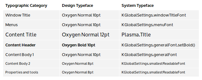
The typeface styles are allocated throughout the user interface as follows. Set system defaults and conduct design activities using the design typeface. Implement the design using the corresponding system typeface to respect user typeface choices that are different from the default.
- A monospace version of the Content Body 1 typeface should be used for code content.
- Typography is treated like any other graphic element when considering spacing and alignment.
- The number of typeface variations should be minimized (~ three) in any single design.
- Typeface point sizes correspond to actual typeface sizes at the default xorg 96 dpi setting, where 1 pt = 1/72 inch (0.35mm).
- Multi-line blocks of text are either left or right aligned; center alignment for multi-line blocks of text is avoided.
Typographic Category Examples
Menus - Menu bar, Popup menus
Content Title - Category title, Panel popups title
Content Header - Section headers
Content Body 1 - Text content, Icon grid items, List items
Content Body 2 - Captions , tooltips
Properties and Tools - Property panel, Toolbar, Status bar
Color and Contrast
The text color and background color can be varied to provide additional hierarchical hints (e.g. selected text). However, the contrast between the text and background color must be sufficient to preserve legibility of the text.
Words per line
Limit line length to between eight to ten words per line. For typographic categories that use an all caps typeface, limit to between three and four words per line.
Exceptions
When the visual design calls for an area of exceptional focus, a larger typeface size may be used. For a significantly larger typeface use a Light typeface weight to keep the stroke width similar to other typeface styles throughout the interface . All other typeface characteristics for the typographic category should be maintained. For such typeface exceptions to be effective, they must be rare.

