Dolphin: Difference between revisions
Added some links to Glossary. |
mNo edit summary |
||
| Line 7: | Line 7: | ||
[[Image:Dolphin default.png|thumb|240px|center]] | [[Image:Dolphin default.png|thumb|240px|center]] | ||
When we open the dolphin from [[Glossary#Kickoff|Kickoff menu]] it shows starting directory - by default it is your [[Glossary#Home directory]]. | When we open the dolphin from [[Glossary#Kickoff|Kickoff menu]] it shows starting directory - by default it is your [[Glossary#Home directory|Home directory]]. | ||
To open file, or go to folder just click on it. You don't have to double-click. It's KDE, not windows - you can click only once :). | To open file, or go to folder just click on it. You don't have to double-click. It's KDE, not windows - you can click only once :). | ||
Revision as of 12:49, 23 September 2008
Template:I18n/Language Navigation Bar
Dolphin is the file manager of KDE.
I'll show how to use dolphin for common file managing tasks, and how to customize it to your needs.

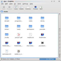
When we open the dolphin from Kickoff menu it shows starting directory - by default it is your Home directory.
To open file, or go to folder just click on it. You don't have to double-click. It's KDE, not windows - you can click only once :).
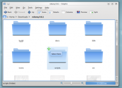
Selecting files - in KDE, by default when you click once on something, it activates. In Windows you have to couble-click for that effect. So, there is problem, what to do in KDE if you don't want to open folder or file, only select it ? Answer is simple - over any icon in dolphin, when you hover your mose over it, there will be small "+" sign. Like that:

When you click that sign, this file/folder will be added to selection. You can easily select many files in that way (selecting by draging rectangle also works).
Many selected files looks like this:

We also see here, how we can deselect files - when file is selected, and you place your mouse cursor over it, in place of "+" sign there will be "-". If you click it, file will be deselected.
![]() D3lphin is a fork of Dolphin for KDE 3. It lacks some features of Dolphin from KDE 4. It is also less known, because for KDE 3 default file manager was Konqueror. This fork is not supported by KDE and is no longer maintained by its author.
D3lphin is a fork of Dolphin for KDE 3. It lacks some features of Dolphin from KDE 4. It is also less known, because for KDE 3 default file manager was Konqueror. This fork is not supported by KDE and is no longer maintained by its author.
![]() In KDE 4 Dolphin opens by default, when we click on any folder, it can also be started from Kickoff menu.
In KDE 4 Dolphin opens by default, when we click on any folder, it can also be started from Kickoff menu.
Dolphin integrates a new concept to use the navigation bar in a faster and more precise way. Therefore a breadcrumb navigation bar is used. Instead of displaying the complete path only the navigation points starting from one of the places are displayed as buttons. By clicking one of these buttons you navigate directly to this folder. So you can reach a parent folder from a sub folder in a very quick way.
Between the buttons which represent a folder there is a small arrow which is a button as well. By clicking this arrow a list of all sub folders of the folder in front of the arrow is shown. So you can change very fast the selected and displayed sub folder.
There is also a classical navigation bar which displayes the complete path. To use this style you can select "View -> Navigation Bar -> Show Full Location" or trigger the keyboard shortcut Ctrl+L. By clicking on the free space next to the last displayed folder in the breadcrumb style you can change to the classical style as well. If the classical style is selected an arrow is displayed at the end of the navigation bar. This arrow is a button which can be used to change back to the breadcrumb style. Of course menu and keyboard shortcut can be used, too.
Split View
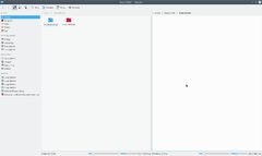
Dolphin offers the possibility to split the current folder view so that two folder views are displayed next to each other as known from Midnight Commander. This is a very comfortable view to copy or move files from one folder to another.

You can split the view with "View -> Split" (keyboard shortcut F3). To change back to only one folder view you can use "View -> Close". The symbol will show you which view will be closed. Depending on the currently active view the minus sign will be shown in the left or right part of the symbol. In general always the inactive view will be closed. This is important to know if you want to use the keyboard shortcut. There is also a button for splitting and closing the view situated in the toolbar. This button displays the minus symbol as well, so it is easy to know which view would be closed.
Of course each view has its own navigation bar and each view can use a different view mode.
View mode
Dolphin supports three different view modes: "Icons", "Details" and "Columns". These can be changed via the menu "View -> View mode" or via the keyboard shortcuts Ctrl+1 (Icons), Ctrl+2 (Details) and Ctrl+3 (Columns). There is also a button for each view mode in the toolbar and the context menu of the folder view offers a submenu "View mode" to change the view mode.
Icons
Each file and each folder is represented by an icon in the view mode "Icons". Instead of displaying an icon a preview of the file can be shown. This behaviour can be turned on/off via the menu "View -> Preview" or via a toolbar button. There exists a size limit for the file previews. This size limitation can be configured via "Settings -> Configure Dolphin -> View Modes -> General" option "File Previews -> Maximum file size". There is also an option to use thumbnails embedded in files.
The files in the currently selected folder are sorted in alphabetical order by default. The way of sorting can be changed via menu "View -> Sort by". The following sort criteria are available:
- Name
- Size
- Date
- Permissions
- Owner
- Group
- Type
Additionally the sorting sequence can be defined by "View -> Sort by -> Descending".
There is the possibility to display additional information below the icons. These can be turned on/off via "View -> Additional Information". In principal the same criteria which are available as search criteria can be selected.
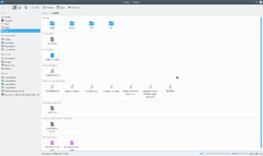
You can group the icons to achieve a better overview. This is turned on via "View -> Show in Groups". Now the icons are grouped and the groups are divided by a horizontal line containing the name of the group as caption. The grouping is related to the selected search criterium.

