Test/sv: Difference between revisions
Updating to match new version of source page |
Updating to match new version of source page |
||
| Line 81: | Line 81: | ||
== Variables == | == Variables == | ||
[http://translatewiki.net/wiki/Page_translation#Markup This description] of variables seems promising. Lets make a variable | [http://translatewiki.net/wiki/Page_translation#Markup This description] of variables seems promising. Lets make a variable 10.5.0 and see how it translates. | ||
Revision as of 16:42, 2 July 2011
This page is only for testing page translation feature.
Dokumentation
Sidöversättningsfunktionen erbjuder kontrollerad översättning av wiki-sidor till andra språk. Med andra ord borde innehållet i varje översatt sida vara likvärdig med originalsidan. Originalsidan delas upp i avsnitt eller stycken, som sedan översätts individuellt. Förändringar kan även spåras stycke för stycke. Dessa avsnitt översätts med hjälp av Special:Översätt, som erbjuder de vanliga funktionerna från meddelandeöversättning: visning av översättningar till andra språk, meddelandedokumentation. En ny funktion som för tillfället är unik för sidöversättningen är en skillnadsvisning av ändrade meddelanden.
En översättningssida byggs upp automatiskt av översatta stycken, med originalsidan som utgångspunkt. Varje översättningssida tilldelas en procentsiffra för hur färdig den är, som beräknas utifrån de översatta styckena och som minskar om dessa översättningar är inaktuella. De gamla (inaktuella) översättningarna blir också markerade.
Something else
A cat walks. How to use #-links with the translation system: Get Hot New Stuff
Images in paragraphs
I want to investigate how images can be places in the middle of paragraphs without causing the imfamous shortening of the first line after the image:

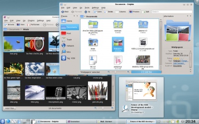
Here we just have the image code between two lines of text with no blank lines in between. This should keep the whole paragraph in one translation unit but look exceedingly ugly! The code for this image was [[Image:Kde440-desktop.jpg|400px|center]].
It doesn't look ugly, though. Can anyone explain why? Perhaps it has to do with the options used.

This time I used the 'thumb' option. How does that look? Is the line shortened now? Yes it is, so it would appear, that the problem is caused by the 'thumb' option. The code for this image was [[Image:Kde440-desktop.jpg|thumb|400px]].
I'll just make one more paragraph to see what happens if no options at all are given (other than size):
 This doesn't look right, either. Even if the image is wide enough to fill the whole line (and so avoid text aligned with the bottom of the image) there is still the problem with to little vertical spacing between text and image. The code for this image was [[Image:Kde440-desktop.jpg|400px]].
Can we conclude, that future guidlines for writers should specify, that images appearing in between text sections should never have the 'thumb' option selected? It seems that this would be a good idea. It also seems, that if the image appears in the middle of a paragraph it should have the 'center' option selected.
Smileys
The standard smiley image is too large. It pushes lines apart, which doesn't look good. It should be made smaller. I'll try to find the proper size ![]() . This it how it looks when nothing is done. On my display it is far too big. If I specify a size of 11px, this is how it looks:
. This it how it looks when nothing is done. On my display it is far too big. If I specify a size of 11px, this is how it looks: ![]() . Much better, now the size of the smiley is about the same as a capital letter (it would look even better if it could be lowered 1 or 2px). It could be larger without pushing lines apart - here is a 15px sized smiley
. Much better, now the size of the smiley is about the same as a capital letter (it would look even better if it could be lowered 1 or 2px). It could be larger without pushing lines apart - here is a 15px sized smiley ![]() (actually I believe this line has been lowered just a bit, but maybe not too much?
(actually I believe this line has been lowered just a bit, but maybe not too much?
Of course it would be better to use a template so that writers would not need to worry about these details ![]() . The template Template:Smiley is just a simple code snippet. Perhaps it can be expanded to allow for different browser settings of font size, if that information could be captured inside a template.
. The template Template:Smiley is just a simple code snippet. Perhaps it can be expanded to allow for different browser settings of font size, if that information could be captured inside a template.
Splitting bulleted lists in two translation units
- first
- second
- third
- fourth
Apparently it is possible to split a bulleted list in two translation units. Special:myLanguage/Tasks_and_Tools
Nested lists: Numbered:
- First main item
- First sub item
- Second sub item
- Second main item
- Third main item
- Third sub item
A Table
| Jumping around in code | |
|---|---|
| Ctrl+Alt+O | Quick open file: enter part of a filename and select among all the files in the current session's projects' directory trees that match the string; the file will then be opened |
| Ctrl+Alt+C | Quick open class: enter part of a class name and select among all class names that match; the cursor will then jump to the class declaration |
| Ctrl+Alt+M | Quick open function: enter part of a (member) function name and select among all names that match; note that the list shows both declarations and definitions and the cursor will then jump to the selected item |
| Other things | |
| Ctrl+_ | Collapse one level: remove this block from view, for example if you want to focus on the bigger picture within a function |
| Ctrl++ | Expand one level: undo the collapsing |
Variables
This description of variables seems promising. Lets make a variable 10.5.0 and see how it translates.
