User:Andrew/VisualDesignGuide/Style/Color: Difference between revisions
Appearance
No edit summary |
No edit summary |
||
| Line 1: | Line 1: | ||
= Color = | = Color = | ||
[[File:VDGColors.png ]] | [[File:VDGColors.png ]] | ||
* Primary colors are used throughout the main interface of the applications and workspaces. Plasma Blue is used as the primary highlight color. | * Primary colors are used throughout the main interface of the applications and workspaces. '''Plasma Blue''' is used as the primary highlight color. | ||
* Secondary colors are used sparingly as accents throughout the visual design. | * Secondary colors are used sparingly as accents throughout the visual design. | ||
* Where transparency is used (e.g. shadows) consider using the opacities listed. | * Where transparency is used (e.g. shadows) consider using the opacities listed. | ||
Latest revision as of 19:41, 17 March 2014
Color
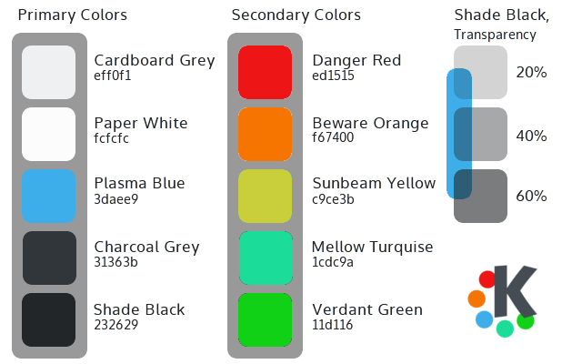
- Primary colors are used throughout the main interface of the applications and workspaces. Plasma Blue is used as the primary highlight color.
- Secondary colors are used sparingly as accents throughout the visual design.
- Where transparency is used (e.g. shadows) consider using the opacities listed.

