Projects/Usability/HIG/Layout/ViewingVsEditing: Difference between revisions
Appearance
| Line 1: | Line 1: | ||
==Purpose== | ==Purpose== | ||
In most cases information should be presented for viewing not editing. Presenting input controls to the user when they are not needed creates clutter and | In most cases information should be presented for viewing not editing. Presenting input controls to the user when they are not needed creates unnecessary clutter and distraction, interfering with the user's focus on the information. | ||
==Guideline== | ==Guideline== | ||
Revision as of 18:42, 23 July 2014
Purpose
In most cases information should be presented for viewing not editing. Presenting input controls to the user when they are not needed creates unnecessary clutter and distraction, interfering with the user's focus on the information.
Guideline
- Do not use input controls to show information unless there is an explicit request to edit the information.
- Follow the typography alignment and spacing guidelines to layout information in a way that is easy to understand.
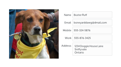
- Provide a clear starting point for viewing the information. For the contact details example, use a large contact photo to anchor the layout and set the contact name in large type to direct the users eye to next location.
- Provide a separate mode for editing the data when requested by the user (via a button, toolbutton or menu item).
- Alternatively, in-line editing can be provided to edit a single data element at a time.


