Koko: Difference between revisions
Appearance
Atulsharma (talk | contribs) No edit summary |
Marked this version for translation |
||
| (7 intermediate revisions by 4 users not shown) | |||
| Line 1: | Line 1: | ||
<languages /> | <languages /> | ||
<translate> | <translate> | ||
<!--T:42--> | |||
{{GrafBreadCrumbs|1=Koko}} | |||
<!--T:1--> | <!--T:1--> | ||
{|class="tablecenter vertical-centered" | {|class="tablecenter vertical-centered" | ||
| Line 14: | Line 17: | ||
<!--T:4--> | <!--T:4--> | ||
* The user can browse the images of the standard '''Pictures''' directory. If the user chooses a collection then a new column is pushed into the row and if he/she chooses an image then the chosen image is shown in high resolution. | * The user can browse the images of the standard '''Pictures''' directory. If the user chooses a collection then a new column is pushed into the row and if he/she chooses an image then the chosen image is shown in high resolution. | ||
<!--T:11--> | |||
{| class="tablecenter vertical-centered" | {| class="tablecenter vertical-centered" | ||
| [[Image:Koko-normal.png | 380px]] || | | | [[Image:Koko-normal.png | 380px]] || | | ||
| Line 19: | Line 24: | ||
|} | |} | ||
* The user can also browse the images according to various filters. The user can select the filters from the left sidebar. | <!--T:12--> | ||
- '''folders''': the grid view for this filter shows the mixed images and folders ie the images are shown in a hierarchical manner as the files are shown in a file manager. A particular grid view can have folders as well as images in it. | * The user can also browse the images according to various filters. The user can select the filters from the left sidebar.</translate> | ||
<translate> | |||
- '''time ( dates, weeks, months, years)''': the grid view for this filter shows the dates/weeks/months/years as a collection. Each collection is represented by the thumbnail image along with the label representing the time for particular collection. The first row shows the collections and when a collection is chosen then a column is pushed into the row whose grid view shows the images belonging to the particular selected collection. | <!--T:13--> | ||
** '''folders''': the grid view for this filter shows the mixed images and folders ie the images are shown in a hierarchical manner as the files are shown in a file manager. A particular grid view can have folders as well as images in it.</translate> | |||
- '''place ( cities, states, countries)''': the grid view for this filter shows the | <translate> | ||
<!--T:14--> | |||
** '''time ( dates, weeks, months, years)''': the grid view for this filter shows the dates/weeks/months/years as a collection. Each collection is represented by the thumbnail image along with the label representing the time for particular collection. The first row shows the collections and when a collection is chosen then a column is pushed into the row whose grid view shows the images belonging to the particular selected collection.</translate> | |||
<translate> | |||
<!--T:15--> | |||
** '''place (cities, states, countries)''': the grid view for this filter shows the cities/states/countries as a collection. Each collection is represented by the thumbnail image along with the label representing the place for particular collection. The first row shows the collections and when a collection is chosen then a column is pushed into the row whose grid view shows the images belonging to the particular selected collection. | |||
<!--T:16--> | |||
{| class="tablecenter vertical-centered" | {| class="tablecenter vertical-centered" | ||
| [[Image:Koko-normal.png | 380px]] | | [[Image:Koko-normal.png | 380px]] | ||
| Line 31: | Line 42: | ||
|} | |} | ||
* Select multiple images at a time and delete or share them( just the images and not the collections or the folders). | <!--T:17--> | ||
- User can select the image by clicking the '''+''' sign that appears on the top right corner of the image on hovering over on the image ( for the desktop UI) | * Select multiple images at a time and delete or share them( just the images and not the collections or the folders).</translate> | ||
<translate> | |||
- For the mobile UI the selecting of images can be activated by "touch and holding" an image. | <!--T:18--> | ||
** User can select the image by clicking the '''+''' sign that appears on the top right corner of the image on hovering over on the image ( for the desktop UI)</translate> | |||
- Some other options are also available for the grid view such as "Select All"( is enabled when there is at least one image in the grid view) & "Deselect all", "Share all", "Delete all"( are enabled when images are selected) | <translate> | ||
<!--T:19--> | |||
- '''Select all''': Selects all the images in the grid. | ** For the mobile UI the selecting of images can be activated by "touch and holding" an image.</translate> | ||
<translate> | |||
- '''Deselect all''': Deselects all the selected images | <!--T:20--> | ||
** Some other options are also available for the grid view such as "Select All"( is enabled when there is at least one image in the grid view) & "Deselect all", "Share all", "Delete all"( are enabled when images are selected)</translate> | |||
- '''Share all''': Share all opens a popup that handles further sharing of all the selected images. | <translate> | ||
<!--T:21--> | |||
- '''Delete all''': Move all the selected images to trash. | ** '''Select all''': Selects all the images in the grid.</translate> | ||
<translate> | |||
<!--T:22--> | |||
** '''Deselect all''': Deselects all the selected images</translate> | |||
<translate> | |||
<!--T:23--> | |||
** '''Share all''': Share all opens a popup that handles further sharing of all the selected images.</translate> | |||
<translate> | |||
<!--T:24--> | |||
** '''Delete all''': Move all the selected images to trash. | |||
<!--T:25--> | |||
{| class="tablecenter vertical-centered" | {| class="tablecenter vertical-centered" | ||
| [[Image:Koko-selectall.png | 380px]] | | [[Image:Koko-selectall.png | 380px]] | ||
| Line 53: | Line 74: | ||
<!--T:5--> | <!--T:5--> | ||
* The user can see an image of a folder in a higher resolution. Images can be viewed in windowed mode as well as full screen mode which can be toggled by "Key F" | * The user can see an image of a folder in a higher resolution. Images can be viewed in windowed mode as well as full screen mode which can be toggled by "Key F" | ||
<!--T:26--> | |||
{| class="tablecenter vertical-centered" | {| class="tablecenter vertical-centered" | ||
| [[Image:Koko-imageviewer.png | 380px]] || | | | [[Image:Koko-imageviewer.png | 380px]] || | | ||
| Line 58: | Line 81: | ||
|} | |} | ||
<!--T:6--> | ===Image Viewer=== <!--T:6--> | ||
The user can make simple edits to the image | <!--T:27--> | ||
The user can make simple edits to the image</translate> | |||
<translate> | |||
<!--T:28--> | |||
*'''Brightness''' - The brightness slider( top of the imageviewer) lets the user change the brightness of the image. After changing the slider value the brightness of the image changes accordingly. Sliding to the right increases the brightness where as sliding to left decreases the brightness. After changing the brightness user has to confirm whether he/she wants to save the changes or not to the original image. | *'''Brightness''' - The brightness slider( top of the imageviewer) lets the user change the brightness of the image. After changing the slider value the brightness of the image changes accordingly. Sliding to the right increases the brightness where as sliding to left decreases the brightness. After changing the brightness user has to confirm whether he/she wants to save the changes or not to the original image. | ||
<!--T:29--> | |||
[[Image:Koko-imageviewerbrightness.png | 500px]] | [[Image:Koko-imageviewerbrightness.png | 500px]] | ||
<!--T:30--> | |||
*'''Rotate''' - Rotation Automatically saves the rotated image on the disk | *'''Rotate''' - Rotation Automatically saves the rotated image on the disk | ||
<!--T:31--> | |||
[[Image:Koko-imageviewercontext.png | 500px]] | [[Image:Koko-imageviewercontext.png | 500px]] | ||
<!--T:32--> | |||
'''Share''' - Just Click the share action at the bottom of the screen to share the current across various platforms | '''Share''' - Just Click the share action at the bottom of the screen to share the current across various platforms | ||
<!--T:33--> | |||
[[Image:Koko-imageviewershare.png | 500px]] | [[Image:Koko-imageviewershare.png | 500px]] | ||
<!--T:34--> | |||
'''Zoom''' - Imageviewer provides the '''double click zoom''', '''Pinch zoom''' and '''CTRL + click zoom''' | '''Zoom''' - Imageviewer provides the '''double click zoom''', '''Pinch zoom''' and '''CTRL + click zoom''' | ||
<!--T:35--> | |||
{| class="tablecenter vertical-centered" | {| class="tablecenter vertical-centered" | ||
| [[Image:Koko-imageviewerctrlzoom.png | 380px]] || | | | [[Image:Koko-imageviewerctrlzoom.png | 380px]] || | | ||
| [[Image:Koko-imageviewerzoom.png | 380px]] | | [[Image:Koko-imageviewerzoom.png | 380px]] | ||
|} | |} | ||
==Perks of using Kirigami== <!--T:36--> | |||
<!--T:37--> | |||
* No need to create separate code base for the mobile | |||
<!--T:38--> | |||
* The application for the '''Material''' theme ie setting the environment variable '''QT_QUICK_CONTROLS_STYLE=Material'''. | |||
<!--T:39--> | |||
{| class="tablecenter vertical-centered" | |||
| [[Image:Koko-themematerial1.png | 380px]] || | | |||
| [[Image:Koko-themematerial2.png | 380px]] || | | |||
| [[Image:Koko-themematerial3.png | 380px]] | |||
|} | |||
<!--T:40--> | |||
* The application for the mobile UI ie setting the environment variable '''QT_QUICK_CONTROLS_MOBILE=1'''. There is just one difference between mobile and desktop UI that is the "Context Drawer"(right side-bar) in mobile and "ToolBar"( at the bottom) in desktop for the gridview | |||
<!--T:41--> | |||
{| class="tablecenter vertical-centered" | |||
| [[Image:Koko-mobilecontext.png | 380px]] || | | |||
| [[Image:Koko-mobiletouchhold.png | 380px]] | |||
|} | |||
<!--T:10--> | <!--T:10--> | ||
Latest revision as of 07:16, 31 October 2020
Home » Applications » Graphics » Koko
 |
Koko - browse, edit and share your images |
Koko is a simple image gallery application that is designed to view, edit and share the images.
Features
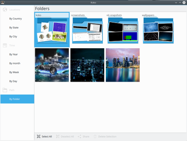
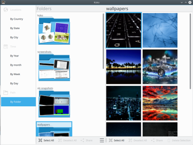
- The user can browse the images of the standard Pictures directory. If the user chooses a collection then a new column is pushed into the row and if he/she chooses an image then the chosen image is shown in high resolution.
 |
|
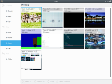
- The user can also browse the images according to various filters. The user can select the filters from the left sidebar.
- folders: the grid view for this filter shows the mixed images and folders ie the images are shown in a hierarchical manner as the files are shown in a file manager. A particular grid view can have folders as well as images in it.
- time ( dates, weeks, months, years): the grid view for this filter shows the dates/weeks/months/years as a collection. Each collection is represented by the thumbnail image along with the label representing the time for particular collection. The first row shows the collections and when a collection is chosen then a column is pushed into the row whose grid view shows the images belonging to the particular selected collection.
- place (cities, states, countries): the grid view for this filter shows the cities/states/countries as a collection. Each collection is represented by the thumbnail image along with the label representing the place for particular collection. The first row shows the collections and when a collection is chosen then a column is pushed into the row whose grid view shows the images belonging to the particular selected collection.

|
|
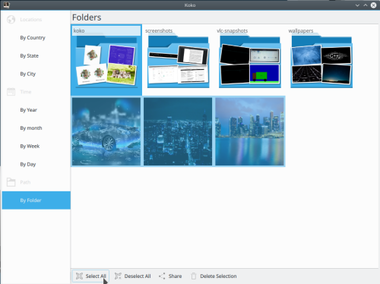
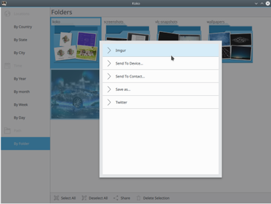
- Select multiple images at a time and delete or share them( just the images and not the collections or the folders).
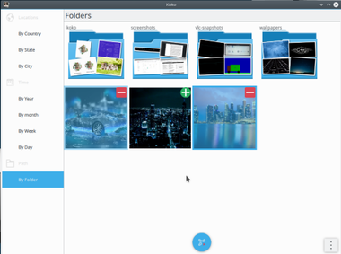
- User can select the image by clicking the + sign that appears on the top right corner of the image on hovering over on the image ( for the desktop UI)
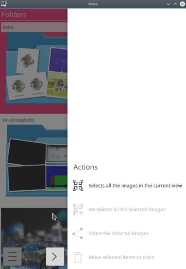
- For the mobile UI the selecting of images can be activated by "touch and holding" an image.
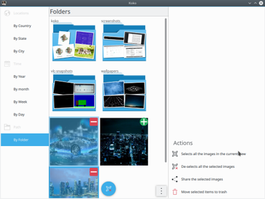
- Some other options are also available for the grid view such as "Select All"( is enabled when there is at least one image in the grid view) & "Deselect all", "Share all", "Delete all"( are enabled when images are selected)
- Select all: Selects all the images in the grid.
- Deselect all: Deselects all the selected images
- Share all: Share all opens a popup that handles further sharing of all the selected images.
- Delete all: Move all the selected images to trash.
|
|
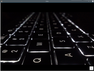
- The user can see an image of a folder in a higher resolution. Images can be viewed in windowed mode as well as full screen mode which can be toggled by "Key F"
 |

|
Image Viewer
The user can make simple edits to the image
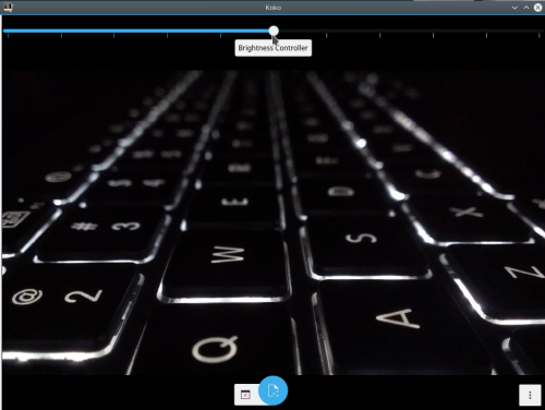
- Brightness - The brightness slider( top of the imageviewer) lets the user change the brightness of the image. After changing the slider value the brightness of the image changes accordingly. Sliding to the right increases the brightness where as sliding to left decreases the brightness. After changing the brightness user has to confirm whether he/she wants to save the changes or not to the original image.
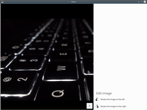
- Rotate - Rotation Automatically saves the rotated image on the disk
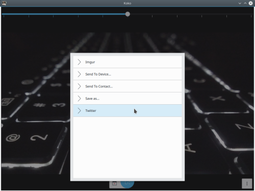
Share - Just Click the share action at the bottom of the screen to share the current across various platforms
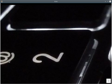
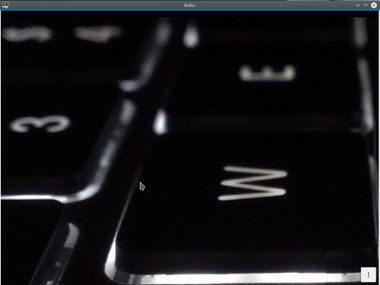
Zoom - Imageviewer provides the double click zoom, Pinch zoom and CTRL + click zoom
 |
|
Perks of using Kirigami
- No need to create separate code base for the mobile
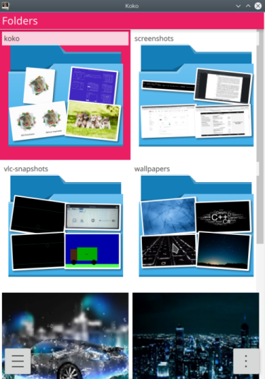
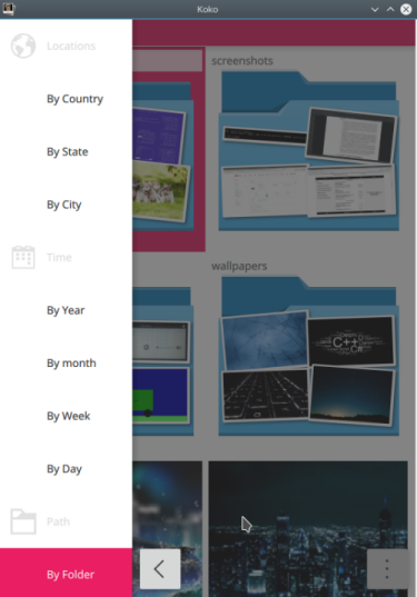
- The application for the Material theme ie setting the environment variable QT_QUICK_CONTROLS_STYLE=Material.
 |
 |
|
- The application for the mobile UI ie setting the environment variable QT_QUICK_CONTROLS_MOBILE=1. There is just one difference between mobile and desktop UI that is the "Context Drawer"(right side-bar) in mobile and "ToolBar"( at the bottom) in desktop for the gridview
 |
|

