KWord/Tutorials/SecondLayout/da: Difference between revisions
Appearance
Importing a new version from external source |
Importing a new version from external source |
||
| Line 6: | Line 6: | ||
|} | |} | ||
I denne øvelse genopfrisker du hvad du lærte i den første øvelse: | |||
* | * at tilføje tekstbokse og tilpasse deres størrelse og position | ||
* | * at formattere tekst* at tilføje illustrationer | ||
* | * at tilpasse deres størrelse og position | ||
* | |||
You will create a page suitable for publicising a place or event, positioning and grouping images. We will base this on holiday photos. | You will create a page suitable for publicising a place or event, positioning and grouping images. We will base this on holiday photos. | ||
Revision as of 15:09, 7 February 2011
Andet layoutproject - for et sted eller en begivenhed
 |
I vores anden layoutøvelse skal du bruge dine egne billeder og tekst til at udforske positionering og gruppering af billeder. |
I denne øvelse genopfrisker du hvad du lærte i den første øvelse:
- at tilføje tekstbokse og tilpasse deres størrelse og position
- at formattere tekst* at tilføje illustrationer
- at tilpasse deres størrelse og position
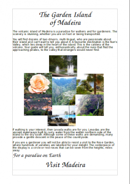
You will create a page suitable for publicising a place or event, positioning and grouping images. We will base this on holiday photos.
Before you start you may find it helpful to create a temporary folder containing all the pictures you intend to use. For the purpose of this tutorial you should scale your pictures to no more than 125mm (5in) wide as inserting large images has an impact on printing time.
As in our first layout project, select the blank page template and adjust your margins.
- For the first part of our album, write your heading as you did before, and a few lines of introductory text.
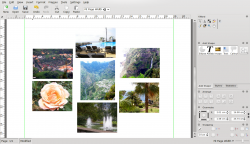
- Bring in a collection of pictures to make your introductory collage, and arrange them in a cluster. Make them approximately the size you want, but don't worry about being accurate.
- Choose one of the pictures that's approximately the size you want. The geometry of the frame is displayed on the bottom right of your screen. Make a note of the height and width
- On the tab set the width and height to the size you determined. Do this for every picture, so that they are a matched set for size.

- Now the size of the photos is fixed, check for colour balance - if you have two similar coloured photos, should they be moved to get a better balance?
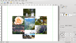
- We are going to pull the photos in to overlap - you will necessarily lose part of the picture, so are the more boring bits where the overlaps might occur? Move them around, if necessary.
- As you pull them in and can see the overlaps, experiment with layering them - from the menu bar, , or , until you are happy with the result. Some collections of picture work better than others and you may have to compromise.

- Holding down Ctrl, click on each of the photos, then on the Group icon
 . You will find that you can now move the whole group as one object. Should you wish to make changes, simple use the Ungroup icon
  , make your changes, then re-group the photos. In this instance we don't want any text to flow alongside these images, so right-click on the group,and select , tab, and select .
- Add the rest of your text, and maybe a slogan to end. At this point you may find that you don't like the balance of your page, in which case, drag the photo group around, slowly, watching how your text adapts. When you feel you have the best balance you can manage, you're done.
