LabPlot/2DPlotting/BoxPlot: Difference between revisions
| Line 13: | Line 13: | ||
== Outliers == | == Outliers == | ||
With the above definitions we can use the following rule of thumb to identify outliers: | |||
* Outlier - any value lying beyond either inner fence. | |||
* Far outlier - any value lying beyond either outer fence. | |||
Note that the rule of thumb for outliers is just a handy guideline that doesn't necessarily substitute good judgment. | |||
== Jittering == | == Jittering == | ||
Revision as of 07:34, 20 June 2021
Basic Concepts
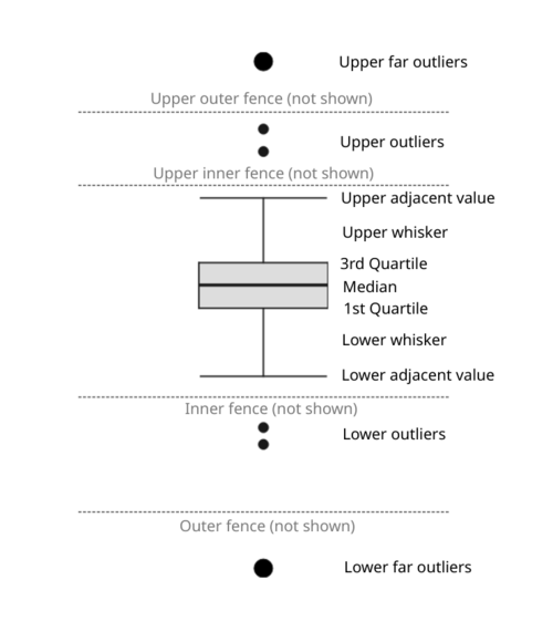
A box plot (also known as box-and-whisker plot) visualizes the data set by means of a small number of quantities providing a summary of the distribution of values in a set of data.
Elements of a box plot:

- Box - the upper and the lower lines of the box correspond to the third (Q3) and to the first (Q1) quartiles respectively. The difference between Q3 and Q1 is called the interquartile range (IQR). The height of the box represents the IQR.
- Median line - the line dividing the box into two parts and representing the median value of the data set.
- Imaginary inner fences (not shown) - the upper inner fence represents the value that is 1.5 times IQR above the Q3 and the lower inner fence represents the value that is 1.5 times IQR below the Q1.
- Imaginary outer fences (not shown) - the upper outer fence represents the value that is 3 times IQR above the Q3 and the lower outer fence represents the value that is 3 times IQR below the Q1.
- Adjacent values - these are the outermost values on each end that are still within the corresponding inner fence.
- Whiskers - the vertical lines extending from Q3 and Q1 to upper and lower adjacent values respectively.
- Caps - the horizontal lines referring to upper and lower adjacent values.
Outliers
With the above definitions we can use the following rule of thumb to identify outliers:
- Outlier - any value lying beyond either inner fence.
- Far outlier - any value lying beyond either outer fence.
Note that the rule of thumb for outliers is just a handy guideline that doesn't necessarily substitute good judgment.
Jittering
Box plot summary doesn't provide any insights into the actual distribution of numerical values in the data set can hide potentially important information. To get more information about the distribution of values, jittering can be added on top of the actual box plot visualization.
TODO: use the data sets presented on https://www.autodesk.com/research/publications/same-stats-different-graphs having completely different distribution but leading to the same box plot visualizations and show how jittering can provide more insights.
Note: instead of (or in addition to) jittering, a combined visualization of histogram and box plot can be used. TODO: produce an example similar to Darek's visualization.
Notches
TODO: https://stat.ethz.ch/R-manual/R-devel/library/grDevices/html/boxplot.stats.html
