LabPlot/GettingStarted/YourFirstDataImportVisualisation: Difference between revisions
| Line 17: | Line 17: | ||
To create a new spreadsheet, choose "Add New/Spreadsheet" from the context menu in the Project Explorer. A new spreadsheet will be created with the default settings. | To create a new spreadsheet, choose "Add New/Spreadsheet" from the context menu in the Project Explorer. A new spreadsheet will be created with the default settings. | ||
[[File:LabPlot - Getting Started New Spreadsheet.gif | [[File:LabPlot - Getting Started New Spreadsheet.gif]] | ||
Revision as of 17:57, 5 January 2022
Import and visualization of data with LabPlot can be done in 5 easy steps:
Create a new project
The first step is to create a new project by selecting "File/New" from the main menu, if it is not created already:
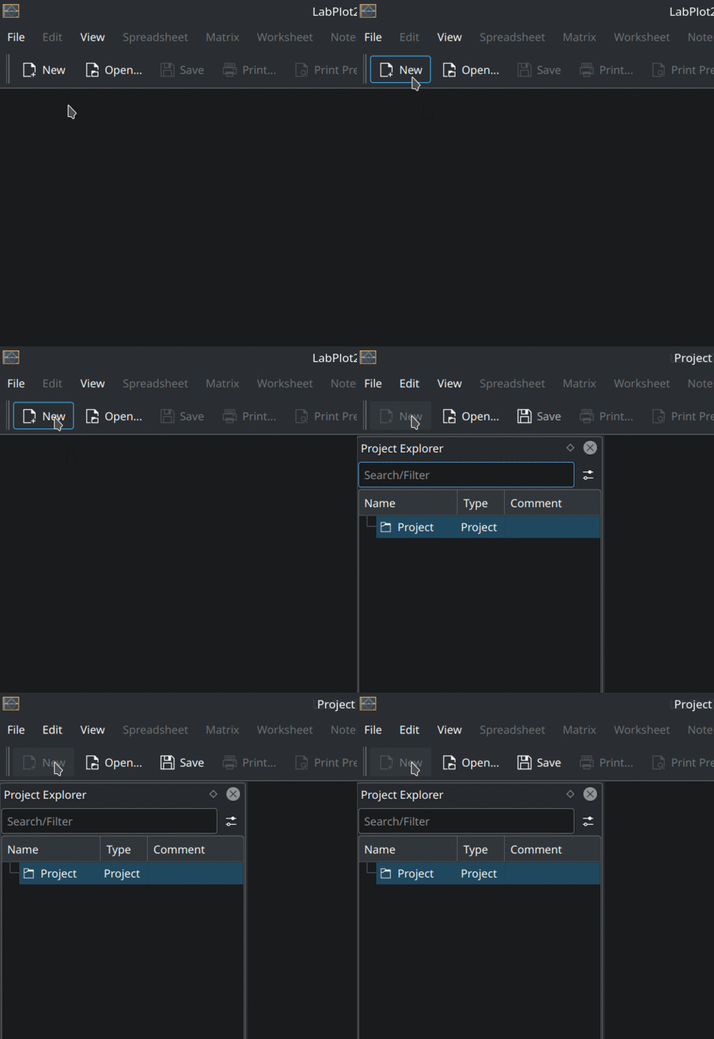
This and many other common actions can be invoked from the main menu, a context menu, a toolbar button, or even via a keyboard shortcut.
After the new project is created, you'll see Project Explorer on the left, showing the structure of the project, and also Properties Explorer on the right, showing the properties of the object currently selected in the project explorer.
The project is still empty and we're now going to add some content to it.
Create a new spreadsheet
The data in LabPlot is organized and stored in Data Containers. In this particular example, we're dealing with data organized in columns (one column per variable), so Spreadsheet is the appropriate data container to import such data into.
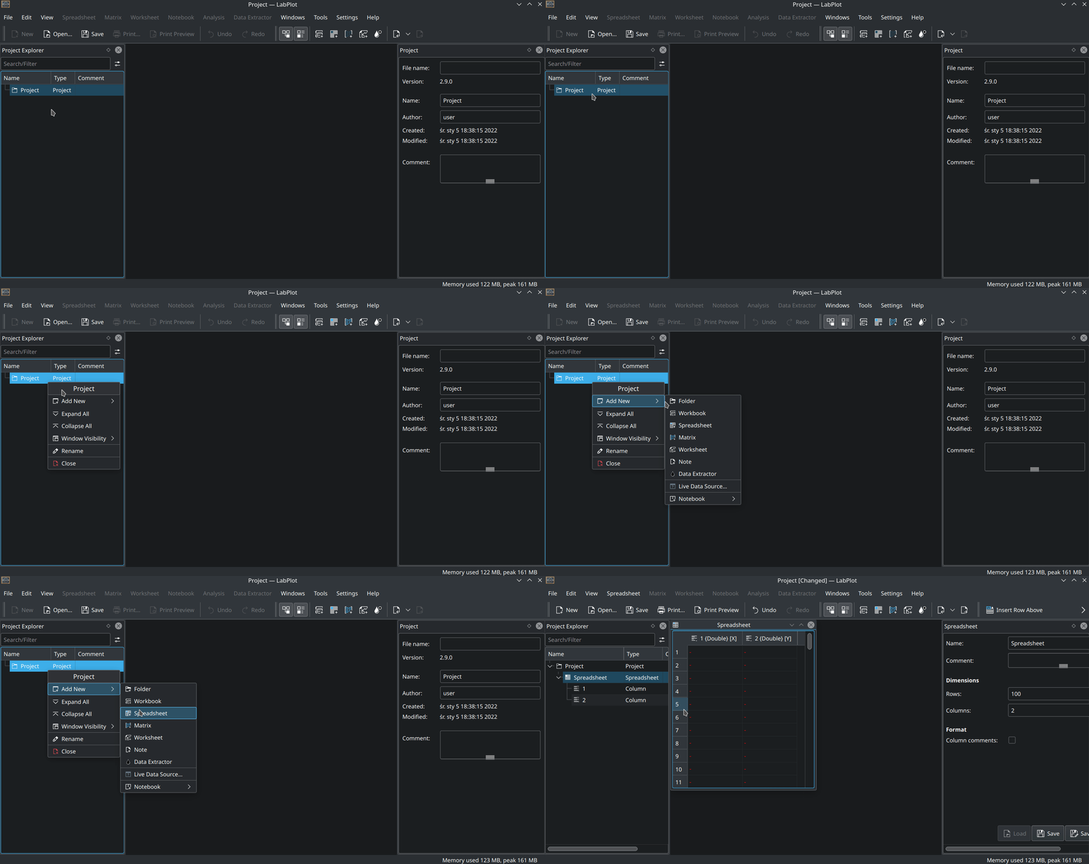
To create a new spreadsheet, choose "Add New/Spreadsheet" from the context menu in the Project Explorer. A new spreadsheet will be created with the default settings.
Now we are ready to import the data into this new spreadsheet.
Import data
To import the data from a file, choose "Import/Import From File" from the main menu:
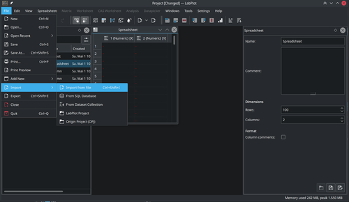
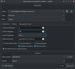
In the "Import Data" dialog box that will appear, specify the location of the file to be imported and other relevant settings (e.g. the separating characters):
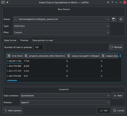
Navigate to the "Preview" tab in this dialog box to check whether the structure of the data will be properly read with the current settings:
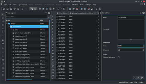
Click on the "OK" button to import the data into the spreadsheet. After the import, you'll see it in the spreadsheet:
Visualize data
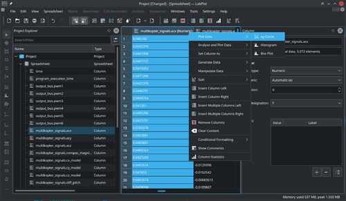
The imported data contains signals from multiple sensors that were placed on a multicopter. We want to visualize the acceleration in the x-direction. For this we select the column containing the data we want to plot and choose "Plot Data/xy-curve" from the context menu of this column:
The "Plot Spreadsheet Data" dialog box will appear:
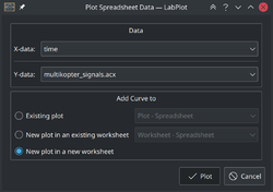
LabPlot automatically assigned the "Time" column to the X-axis. We keep all the other settings as shown below in order to visualize the data in a new plot on a new Worksheet:
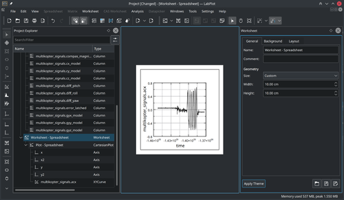
Once the plot is created, you can change its appearance by clicking on the plot or on one of its identifiable parts and then modifying their properties in the Properties Explorer.
Export results
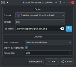
To export the plot as an image, choose "Export" from the main menu and specify the location of the output file and other relevant settings:
