Amarok/QuickStartGuide/TheAmarokWindow: Difference between revisions
Appearance
mNo edit summary |
revert caption edit, this is NOT amarok 2.8 |
||
| Line 12: | Line 12: | ||
<!--T:18--> | <!--T:18--> | ||
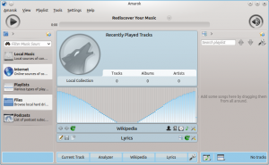
[[File:AmarokNew2.4.png|300px|thumb|center|Amarok 2. | [[File:AmarokNew2.4.png|300px|thumb|center|Amarok 2.4, newly installed]] | ||
<!--T:5--> | <!--T:5--> | ||
Revision as of 12:44, 15 July 2013
The Amarok window
The Amarok window is designed to let you rediscover your music. So, it gives you as much information about your music as possible. While many users will enjoy the default layout, it is fully customizable.
Default layout of the Amarok window
Upon installation, Amarok will look like this:

The Amarok window has four main parts:
- under the top-level menus is the Toolbar which lies above three panes:
- your Media Sources (music collection and other media) in the left pane,
- the Context pane in the center, and
- the Playlist in the right-hand pane.
Using the Amarok window to manage and play your music
Playing music using Amarok usually takes two steps:
- Create a playlist by selecting some of the tracks in your collection, which you will find listed in the Media Sources pane, and send your music to the Playlist pane.
- Play the music in your playlist, using the Playlist pane and/or the Toolbar.
Also, you may want to transfer some of your music to a mobile music player, such as an iPod. The next sections will explain how.
