User:Annew: Difference between revisions
No edit summary |
m testing |
||
| Line 52: | Line 52: | ||
{{Info|This page refers to KWord 1.5. It needs to be revised and updated to KWord from KOffice2. Please remove this notice when you are satisfied that it is correct and complete for KOffice2}} | {{Info|This page refers to KWord 1.5. It needs to be revised and updated to KWord from KOffice2. Please remove this notice when you are satisfied that it is correct and complete for KOffice2}} | ||
::{| | |||
|<imagemap>Image:cwp7.png | |||
default [http://www.x.se/npw] | |||
desc none | |||
</imagemap> | |||
|- | |||
|align="center"|How to Unlock your Widgets | |||
|} | |||
---- | ---- | ||
Revision as of 10:21, 28 August 2009
Saved for re-use: Template:I18n/Language Navigation Bar
 |
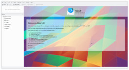
KMail is the email component of Kontact, the integrated personal information manager of KDE. |
Image map:
KWord
|
kwrite ftp://ftp.kde.org/pub/kde/Welcome.msg |
![]() Support for this application can be found from the project's home page
Support for this application can be found from the project's home page
Second Layout Project - for a photo album
Template:I18n/Language Navigation Bar
 |
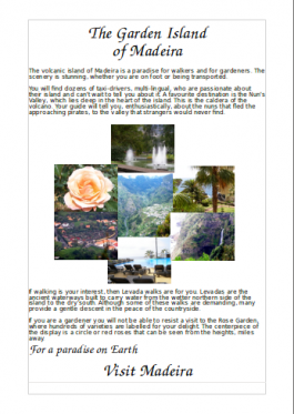
In our second Layout Tutorial you will use your own pictures and text |
In this lesson you will revise the steps of the first tutorial:
- add text boxes and adjust their size and position
- format text
- add illustrations
- adjust their size and position
You will create a page suitable for use in a photo album, using text flow between frames. We will base this on holiday photos.
Before you start you may find it helpful to create a temporary folder containing all the pictures you intend to use. For the purpose of this tutorial you should scale your pictures to no more than 125mm (5in) wide as inserting large images has an impact on printing time.
As in our first layout project, select the blank page template and adjust your margins. Plenty of white space is advisable in a photo album page, but if your margins are too large you will find that either the pictures or text suffer from lack of space.
First, create two Image boxes. Place the first just under the title, and touching the right-hand margin. In that one, place a photo that is typical of your destination. Place a feature photo touching the left-hand margin, approximately corner-to-corner with the first photo.
Now create a text frame,alongside your first picture, roughly filling the availlable space. In Properties, give it a recognisable name, then in the Options tab, set "Do not show the extra text". Close the properties box, and select the Text tool. The text tool options appear at the lower right of the page. Set the font style and size that you want, then either type directly into the box, or paste in ready-made text.
If your text overflows the area selected it will not be visible (due to the setting we just made). Now's the time to create a new text box alongside the second picture. Again, fill the available space. The Connect Text Frames options page will pop up. Click on the named frame you earlier created.


