KWord/Manual/IntroGUI: Difference between revisions
No edit summary |
No edit summary |
||
| Line 10: | Line 10: | ||
*Toolbars | *Toolbars | ||
Menus are always staying at the same place, while dockers and toolbars are dynamic pieces of KWord GUI that can be dragged around the whole interface, float free or be landed/grouped at one of 4 sides of Your screen. This allows for building the interface which You need, not somebody who thinks he is to define what Your word processor / working style / thinking should be like. | |||
The flexibility of Kword GUI allows You to make Your word processor look, for example, like this: | |||
[[File:Interface.png]] | |||
KWord interface, as well as interface of any KOffice application is built around the concept of Dockers. Docker is, essentially a KOffice GUI widget that unite certain related functions. For example, "color chooser" docker allows user to choose a color of editable object, "Add Shape" docker allows user to add different shapes (text, images, etc) to their KWord document. | KWord interface, as well as interface of any KOffice application is built around the concept of Dockers. Docker is, essentially a KOffice GUI widget that unite certain related functions. For example, "color chooser" docker allows user to choose a color of editable object, "Add Shape" docker allows user to add different shapes (text, images, etc) to their KWord document. | ||
Revision as of 08:39, 23 October 2010
KWord GUI (as well as those of other KOffice applications) is flexible, simple and extensible at the same time. Such an interface reflects the ideas of deep integration of different applications in office suite as well as modular structure of both KOffice and KWord as one of its parts.
Key parts of the KWord GUI
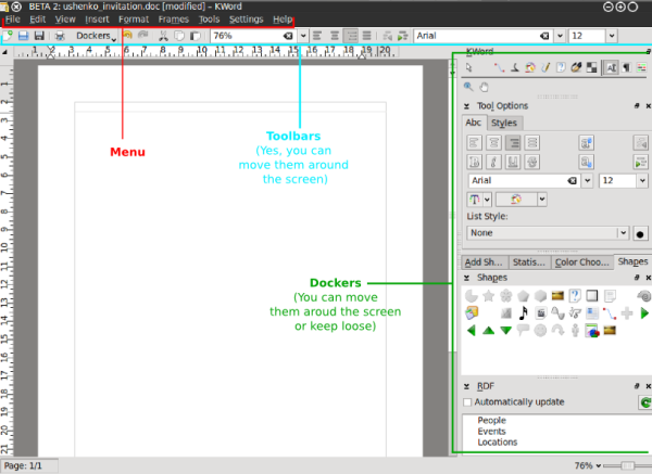
As we see from the picture above, the key components of KWord GUI are the following:
- Menus
- Dockers
- Toolbars
Menus are always staying at the same place, while dockers and toolbars are dynamic pieces of KWord GUI that can be dragged around the whole interface, float free or be landed/grouped at one of 4 sides of Your screen. This allows for building the interface which You need, not somebody who thinks he is to define what Your word processor / working style / thinking should be like.
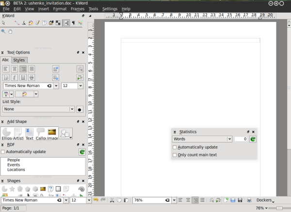
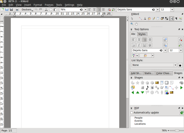
The flexibility of Kword GUI allows You to make Your word processor look, for example, like this:

KWord interface, as well as interface of any KOffice application is built around the concept of Dockers. Docker is, essentially a KOffice GUI widget that unite certain related functions. For example, "color chooser" docker allows user to choose a color of editable object, "Add Shape" docker allows user to add different shapes (text, images, etc) to their KWord document.
Every docker allows for certain editing functionality in KWord. Since the dockers can be easily turned on and off, grouped, they allows to set up the GUI so that only the functions the user actually uses/needs are visible in KWord GUI.
KWord with dockers on the right side.
List of KWord dockers:
- Toolbox
- Tool Options
- RDF
- Add shape
- Statistics
- Color chooser
- Shapes
- Scripts
- Shape properties
- Shadow properties
Governing the dockers (turning on and off)
Of course, each user have different requirements to their word processing tool. Especially when the tool is that versatile as KWord is.
A nice example of that is its RDF functions. It is used, for example, to integrate someone's contacts into Your document, so that when they are changed, say in Your addressbook they are changed in Your document. A cool feature, right? Sure, bur some people do not need it at all. They are happy with typing and making letters big/small and bold/regular.
We easily came to a conclusion that not really everybody needs to have all the dockers in their KWord interface. It is always better to have some more free space for some other dockers.
Since dockers reflect the modularity of KOffice and KWord their number is constantly growing as grows the number of tools and plugins which are available for KWord. And this is the very point where we understand that we need to manage them somehow. Especially if You have a not-so-old notebook with limited screen width.
So, how can You get dockers located on screen in order that is good for you?
Simple:
- Switch off the unnecessary
- Switch on the needed one (yes, those you personally need, not those someone said gotta be in word processor)
- Change the screen edge
- Make dockers independent
- Group them (probably the most important)


