KWord/Tutorials/BasicLayout
First Layout Project
Template:I18n/Language Navigation Bar
In this lesson you will
- add text boxes and adjust their size and position
- format text
- add illustrations
- adjust their size and position
Launch KWord and select the Blank Document template. You will be presented with an empty page, with the size most likely for your region - usually A4 or Letter. Using the Format Menu, select Page Layout. For this project I am using A4, but it shouldn't take much adjustment to fit it to a Letter page.
For this kind of layout you need fairly generous margins, so set the top to 25mm and the other three sides to 20mm. If you work in Imperial, make them 1" at the top and 3/4" on the other sides.
In the right-hand toolbox, under Add Shape, click on the Text shape tool ![]() and draw a box margin to margin and 3cm (about 1.25") high - you can see your cursor position on the ruler at the left. The result will be a coloured box, but that is just a marker. You get a Frameset dialog. This is going to be our banner heading, so you can change its name if yoiu wish, but you won't need to change anything else. Click and the text box fills with sample text. Now Click on the 'T' text editing tool - the sample text disappears and you can add your heading. I used URW Chancery L, 48pt for the title and 24pt for the subheading. Highlight both lines of text and click on
and draw a box margin to margin and 3cm (about 1.25") high - you can see your cursor position on the ruler at the left. The result will be a coloured box, but that is just a marker. You get a Frameset dialog. This is going to be our banner heading, so you can change its name if yoiu wish, but you won't need to change anything else. Click and the text box fills with sample text. Now Click on the 'T' text editing tool - the sample text disappears and you can add your heading. I used URW Chancery L, 48pt for the title and 24pt for the subheading. Highlight both lines of text and click on ![]() to centre it. Create another text box, margin to margin, and 1.5cm deep, and add the sub-text:
to centre it. Create another text box, margin to margin, and 1.5cm deep, and add the sub-text:
|
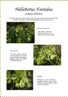
This plant gets its unfortunate name because many people think that the flowers develop a strong smell if taken into a warm room |
While a box is selected, hovering over it produces a cross-arrow cursor. You can use this for large movements of the box. We will later use Properties to make fine adjustments.
That's the heading all sorted. Now we need to look at illustrating our page. Many cameras use a 4:3 format, so we will use Image frames that are 8cm x 6 cm.
 |
Repeat the process, creating this image box immediately below, and just touching the bottom margin. Select the file Hellebore3.jgp. |
| The third image box should be the same size, touching the right margin, and positioned vertically as close as you can to half-way between the other two. Select the file Hellebore2.jpg |  |
Now we need to tweak the position, to get them exactly where we want them. First, make sure you are using the default (pointer) tool ![]()
Look at the image frame that is best aligned to the left margin - select that frame by clicking on it, right-click and select 'Frame/Frameset Properties'. On the Geometry tab you can see position and size. If your margin is 20mm, set X: to 2cm. Correct the Width to 8cm and Height to 6 cm.
Repeat these settings on the other left-hand image, so that they are perfectly aligned. For the right-hand image, set the Width and Height to match the others. Setting X to 11cm should line it up nicely.
Now we turn our attention to adding the descriptive text boxes.
Select the Text shape ![]() , and draw a box approximately 6cm wide and 3 cm deeps, in the center of the space to the right of your first picture. Into that paste the text:
, and draw a box approximately 6cm wide and 3 cm deeps, in the center of the space to the right of your first picture. Into that paste the text:
|
Flowering Season: Late winter, typically starting February and lasting for several weeks. |
You will see the text automatically wrap to the box. Right-click to get the Frame/Frameset Properties, and adjust the width until the wrap gives you reasonably balanced lines.
The second text box is created and adjusted in the same way, using the text:
|
Description: Very dark green, deeply divided palm-like leaves below bright acid-green flowers which are often burgundy-tipped. |
The final text box uses the words:
|
Habitat: Prefers to be out of strong sunlight. Thrives under trees where the bright flowers add a welcome glow. |
Again, adjust the width on the Geometry tab of the Frame/Frameset properties. You now need to check the X setting for the two text boxes Flowering Season and Habitat, making sure that they are identical. The width is less important, but a badly-aligned box is very noticeable. The middle box doesn't have anything to line up with, so just adjust until it looks central in the space.
Just one task left. Return to the heading and sub-heading banners and use the Frame/Frameset Properties to ensure that they start and end on the margins.
That's all there is to it. If you were doing an advertising flyer you could have a smaller-text banner across the bottom with your contact details.
In the next tutorial you will use your own images and text, and we will explore text-flow, both around shapes and between boxes.


