Toolbox
Template:I18n/Language Navigation Bar
This page offers examples of formatting code for common tasks
Add an i18n language bar
| {{Template:I18n/Language Navigation Bar|Toolbox}} |
Simply replace the existing pagename (Toolbar, in this instance) with the name of the page you are creating.
Format your text
Use Headings
- Headings automatically form part of your Table of Contents, so need to be structured. Their place in the tree is governed by multiple '=' characters at each end of the heading. Avoid using a single one - that denotes a page heading, and the automatic page heading should be used. Your major headings will use '==text goes here==', the next level, '===more text===' and so on.
Use bold and italic
- Blips are used to specify bold and italic words.
- Use '''bold text''' to specify bold text and
- ''italic text'' to specify italic text.
Add a code snippet
- Simply adding a space at the beginning of the line displays your text in a fixed font, so 'this snippet of code' becomes
this snippet of code
- If it needs to stand out more, you can enclose it in a box:
this snippet of code
- However, you lose the clarity that the change of font gives. This method may be more useful for extended snippets, of several lines, rather than short ones. The decision should be based on what is aesthetically pleasing in the context of the rest of your page layout.
Add indents
- ':' is used for an indent, and can be used in multiples. A single ':' indents by two characters.
Lists, numbered and bulleted
- * is the symbol to use for bulletted lists. ** gives a second level:
 ::* One star
 ::* Next point
 ::** Sub-point
 ::* Third point
- produces
- One star
- Next point
- Sub-point
- Third point
- Numbered lists are produced in the same way, using '#'.
 ::# A single hash
 ::# Second point
 ::## A sub-point
 ::# Third point
- produces
- A single hash
- Second point
- A sub-point
- Third point
- This is less useful than the bulletted list.
Add a link
There are two kinds of links to learn, internal ones, to another userbase page, and external URL links.
For an internal link you can sometimes simply use [[PageLayout]], where you want to display the name of the page. However, you often need to include the link in a sentence, so you would use
[[PageLayout|this page]]
which displays
External links are slightly different so
[http://techbase.kde.org/Schedules our road map]
displays
our road map which would take you straight to the techbase page.
One last thing to note - when you preview your page, the links are live. This gives you two benefits. You can check (by hovering) that your links are set up as you expected, and you can use a red link to create a new page.
Illustrate your text
Add a single image, centered
[[Image:KMail-kde4.png|250px|center]]
- Note that you can change the position of the image, but the default is left. The size of the image depends on the circumstances, but for screenshots I recommend no less than 250px and no more than 500px.
Make the image clickable, and add a caption
- Where you need to show more detail, create a moderately sized image, clickable, so that the full-size can be seen. Simply add the parameter '|thumb' within the image parentheses.
- A caption can also be added as a parameter, but will only show if '|thumb' is present.
Use tables to precisely place multiple images
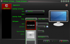
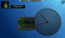
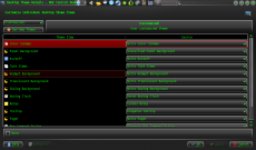
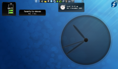
{|style="width:500px" cellpadding="2" |[[Image:Desktop-config-customized.png|230px|center]]||[[Image:Desktop-settings-rightclick.png|230px|center]] |- |[[Image:Desktop-theme-details-dialog.png|230px|center]]||[[Image:Plasma-multiple-themes.png|230px|center]] |}
- displays
- Note that all the parameters for one image are contained within ..., and cells are separated by '||'. To start a new line, insert '|-'
Add Notes and Warnings
Where a note or warning is relevant within your text, use a table, like these:
| ::{|cellpadding="2" |[[Image:Im-status-message-edit.png]]||'''Note'''||Some important information |} |
| ::{| |[[Image:help-hint.png]]||'''Tip'''||Something useful to remember |} |
| ::{| |[[Image:dialog-warning.png|32px]]||'''Warning'''||This is dangerous |} |
Where a note or warning is important enough to need to stand out strongly there are two useful templates, Info and Warning. Use
{{info|This is another way to display your information}}
or
{{warning|This is a very dangerous thing to do}}
Note that the size of the boxes for these two templates are fixed - you cannot alter them.
KDE3 and KDE SC 4 versions of applications
By default, KDE SC 4 is assumed. If the KDE SC 4 version is not yet ready for release it may be necessary to document the KDE3 version. In this case you should add an icon {{KDE3}}
which displays
![]() . Should you be writing about a KDE3 version and KDE SC 4 version on the same page, use icons for both - {{KDE4}} which displays
. Should you be writing about a KDE3 version and KDE SC 4 version on the same page, use icons for both - {{KDE4}} which displays
![]()
Community Applications
The final consideration concerns those applications which are not distributed as core KDE applications. These need to be indicated by an icon, placing {{Community-app}}
at the end of your sentence or line, just as you would to denote a footnote in general writing. You then need to add {{Community-app-footnote}} which will create a footnote, like this:
![]() Support for this application can be found from the project's home page
Support for this application can be found from the project's home page


