Plasma/GroupingDesktop: Difference between revisions
mNo edit summary |
added a screenshot |
||
| Line 3: | Line 3: | ||
== Grouping Desktop == <!--T:1--> | == Grouping Desktop == <!--T:1--> | ||
[[Image:Groupingdesktop.png|512px|center]] | |||
<!--T:2--> | <!--T:2--> | ||
Revision as of 17:16, 24 September 2010
Grouping Desktop

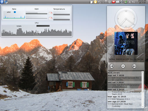
Grouping Desktop is an activity type for the Plasma shells. It allows you to group the widgets you placed on your desktop in different ways.
After you have installed it, you can select Grouping Desktop as your activity from the desktop settings. Click on the desktop toolbox and select . Here select the page and then from the drop-down menu . Click on and you have a grouping Desktop!
Otherwise you can add directly a new activity from the activity manager selecting and from there .
Grid Desktop
Grid Desktop is another activity type which provides a grid for placing your widgets and groups. When creating a new Grid Desktop activity a grid with cells of a default size will be created, though you can always add or remove rows and columns, in order to have as many cells as you want of the size you want.
You can add a new Grid Desktop as you do with the Grouping Desktop.
To see how to manage the grid and its contents look at the Grid Group section.
Grouping Panel
Grouping Panel is a panel with support for grouping your widgets.
You can add a Grouping Panel by clicking on the desktop toolbox and then on . Then select from the list. You can then move and configure the new panel as if it were a normal one.
Groups
The groups are special items which can be used to group other items, widgets or other groups. There are several types of groups, all with a different way of grouping their items. Moving, rotating or removing a group will propagate the action to its items.
- Floating Group: Leaves the widgets you put inside it free to move as if they were on the default desktop.
- Grid Group: Puts its items in a grid.
- Stacking Group: Places its children one over the other, with every one of them moved a little to show the one under it.
- Tabbing Group: Creates one or more pages of widgets selectable by a tab bar. Every page puts its children inside a grid.
- Flow Group: Puts its items in a row or column.
Grid Group
When creating a Grid Group it will create by default a certain number of rows and columns.
If you want to add or remove a row move your cursor to the top or bottom edge of the group. If you want to manage your columns move it to the left or the right side. A thin strip will appear with two buttons: one that and one that a row or a column.
When you drop a widget in a Grid Group it will try to keep its size occupying as many cells as needed. You can anyway resize a widget already dropped: move the mouse cursor over the widget you want to resize and you'll see a little square appearing over a corner of the widget. Dragging it will result in the corner being dragged, with the opposite one staying still. All the corners can be dragged.
Adding a Group
To add a new group click with the right button of the mouse on a Grouping Desktop, on a Grid Desktop or on a Grouping Panel. Then select , which will cause a list of groups to appear. You can then add a group as you add a widget, dropping it over the desktop or panel.
You can add widgets in the new group moving an already created widget over it or dropping one from the widget selector. As you put a widget inside a group you can remove it simply by dragging it.
