Krita/Tutorial 7: Difference between revisions
Marked this version for translation |
Correcter image sizes |
||
| Line 42: | Line 42: | ||
<!--T:15--> | <!--T:15--> | ||
[[image:Krita-tutorial7-A.I.1-1.png|thumb|center| | [[image:Krita-tutorial7-A.I.1-1.png|thumb|center|500px]] | ||
<!--T:16--> | <!--T:16--> | ||
| Line 48: | Line 48: | ||
<!--T:17--> | <!--T:17--> | ||
[[image:Krita-tutorial7-A.1.1-2.png|thumb|center| | [[image:Krita-tutorial7-A.1.1-2.png|thumb|center|500px]] | ||
==== Brush tip: the area of effect, and related dynamics ==== <!--T:18--> | ==== Brush tip: the area of effect, and related dynamics ==== <!--T:18--> | ||
| Line 69: | Line 69: | ||
<!--T:24--> | <!--T:24--> | ||
[[image:Krita-tutorial7-A.I.2.png|thumb|center| | [[image:Krita-tutorial7-A.I.2.png|thumb|center|500px]] | ||
==== Brush size: the rendered lines, and related dynamics ==== <!--T:25--> | ==== Brush size: the rendered lines, and related dynamics ==== <!--T:25--> | ||
<!--T:26--> | <!--T:26--> | ||
[[image:Krita-tutorial7-A.1.3-1.png|thumb|center| | [[image:Krita-tutorial7-A.1.3-1.png|thumb|center|500px]] | ||
<!--T:27--> | <!--T:27--> | ||
| Line 100: | Line 100: | ||
<!--T:34--> | <!--T:34--> | ||
[[image:Krita-tutorial7-A.1.3-2.png|thumb|center| | [[image:Krita-tutorial7-A.1.3-2.png|thumb|center|500px]] | ||
<!--T:35--> | <!--T:35--> | ||
| Line 129: | Line 129: | ||
<!--T:43--> | <!--T:43--> | ||
[[image:Krita-tutorial7-A.1.3-3.png|thumb|center| | [[image:Krita-tutorial7-A.1.3-3.png|thumb|center|500px]] | ||
<!--T:44--> | <!--T:44--> | ||
| Line 141: | Line 141: | ||
<!--T:47--> | <!--T:47--> | ||
[[image:Krita-tutorial7-A.1.3-4.png|thumb|center| | [[image:Krita-tutorial7-A.1.3-4.png|thumb|center|500px]] | ||
=== Use cases === <!--T:48--> | === Use cases === <!--T:48--> | ||
| Line 173: | Line 173: | ||
<!--T:58--> | <!--T:58--> | ||
[[image:Krita-tutorial7-A.II-1.png|thumb|center| | [[image:Krita-tutorial7-A.II-1.png|thumb|center|500px]] | ||
<!--T:59--> | <!--T:59--> | ||
| Line 203: | Line 203: | ||
<!--T:68--> | <!--T:68--> | ||
[[image:Krita-tutorial7-A.II-2.png|thumb|center| | [[image:Krita-tutorial7-A.II-2.png|thumb|center|500px]] | ||
<!--T:69--> | <!--T:69--> | ||
| Line 241: | Line 241: | ||
<!--T:81--> | <!--T:81--> | ||
[[image:Krita-tutorial7-B.I.1.png|thumb|center| | [[image:Krita-tutorial7-B.I.1.png|thumb|center|500px]] | ||
==== Bristle options ==== <!--T:82--> | ==== Bristle options ==== <!--T:82--> | ||
| Line 277: | Line 277: | ||
<!--T:92--> | <!--T:92--> | ||
[[image:Krita-tutorial7-B.I.2-1.png|thumb|center| | [[image:Krita-tutorial7-B.I.2-1.png|thumb|center|500px]] | ||
<!--T:93--> | <!--T:93--> | ||
| Line 306: | Line 306: | ||
<!--T:101--> | <!--T:101--> | ||
[[image:Krita-tutorial7-B.I.2-2.png|thumb|center| | [[image:Krita-tutorial7-B.I.2-2.png|thumb|center|500px]] | ||
==== Ink Depletion tab ==== <!--T:102--> | ==== Ink Depletion tab ==== <!--T:102--> | ||
| Line 323: | Line 323: | ||
<!--T:107--> | <!--T:107--> | ||
[[image:Krita-tutorial7-B.I.3-1.png|thumb|center| | [[image:Krita-tutorial7-B.I.3-1.png|thumb|center|500px]] | ||
<!--T:108--> | <!--T:108--> | ||
| Line 356: | Line 356: | ||
<!--T:118--> | <!--T:118--> | ||
[[image:Krita-tutorial7-B.I.3-2.png|thumb|center| | [[image:Krita-tutorial7-B.I.3-2.png|thumb|center|500px]] | ||
<!--T:119--> | <!--T:119--> | ||
| Line 367: | Line 367: | ||
<!--T:122--> | <!--T:122--> | ||
[[image:Krita-tutorial7-B.II.png|thumb|center| | [[image:Krita-tutorial7-B.II.png|thumb|center|500px]] | ||
<!--T:123--> | <!--T:123--> | ||
Revision as of 17:00, 16 February 2013
Sketch, Hairy and Chalk Brushes
Sketch Brush
The Sketch brush is easily the most fun brush to sketch with in Krita. LukasT originally adapted the Sketch brush from Project Harmony, which in turn was inspired by Scribbler.
In fact, LukasT already has a nice presentation of the Sketch Brush.
For this reason I won't spend too long explaining the settings.
Settings
Overview
To better explain this, I have set the brush visualization to "outline." You can do so too at: .
When using the Sketch brush, think of it in 2 parts:
- The area of effect: this is the area defined by the brush tip and brush outline. The developers refer to this as the "brush mask."
- The rendered lines: I don't think there are official terms, so I'll borrow the terms I used for the Curve brush:
- The connection line: the line drawn from one mouse position to the next. Larger areas of effects will produce thicker-looking connection lines.
- The curve lines, which form between connection lines when the area of effect covers both the current portion of the line (which it always does) and a previous portion of the line.
This distinction actually isn't quite correct: although there is a central connection line, the "connection line" you see is actually the (usually thin, barely visible) actual connection line and a group of shorter curve lines. For the sake of description, though, I will still call this group of lines the "connection line." All that probably sounded confusing, but it's quite simple once you see it:
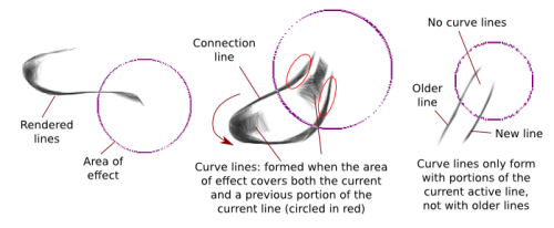
Also, by default, the Sketch Brush uses the "Build Up" painting mode, and a default opacity of 30%. This combination is what allows for the natural-looking variations in opacity. Here are some comparisons:
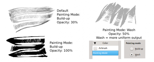
As I previously described, the brush tip defines the "Area of effect". Curve lines only form when the area of effect also covers a previous portion of the line being drawn. The following two dynamics affect the area of effect and not the rendered lines:
- Size: by setting this to pressure or speed, you can prevent curve lines from forming, for example, by decreasing the size of the brush so that it won't touch a previous portion of the curve
- Rotation: again, this affects the brush tip / area of effect
In theory, you can create different effects by using different forms of brushes. In practice, however, it is difficult to control this to create any specific effect, so you may as well just stick with the round brush.
One possibility, however, is to use an ellipse brush, and set Rotation to Drawing Angle. What this does is prevent curve lines from forming by preventing the area of effect from touching the rest of the line, to a point:

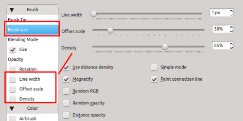
The "Brush size" tab controls the actual output of the rendered lines. The main options here are:
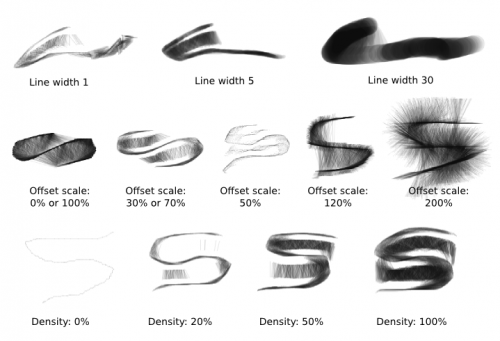
- Line width: This controls the width of both connection lines and curve lines.
- Offset scale: When curve lines are formed, this value roughly determines the distance from the curve lines to the connection lines:
- This is a bit misleading, because a value of 0% and a value of 100% give similar outputs, as do a value of say 30% and 70%. You could think that the actual value range is between 50% and 200%.
- 0% and 100% correspond to the curve lines touching the connection lines exactly.
- Above 100%, the curve lines will go further than the connection lines, forming a fuzzy effect.
- Density: This controls the number of curve lines formed, thus their density. Notice that with density 0%, you're left with the barely visible "real" connection line (unless you're using a thick enough line width).
Each of the above three have corresponding dynamics.
What's more, you will find the following options:
- Use distance density: the further the line covered is from the center of the area of effect, the less the density of the resulting curve lines.
- Magnetify:
- Magnetify is on by default. It's what causes curve lines to form between two close line sections, as though the curve lines are attracted to them like magnets.
- With Magnetify off, the curve line just forms on either side of the current active portion of your connection line. In other words, your line becomes fuzzier when another portion of the line is nearby, but the lines don't connect to said previous portion.
- Random RGB: Causes some slight RGB variations.
- Random Opacity: The curve lines get random opacity. This one is barely visible, so for the example I used line width 12 and 100% opacity.
- Distance Opacity: I can guess what it's supposed to do, but honestly having this on or off didn't produce a visible difference.
- Paint Connection line: As I said, what appears to be the connection line is usually made up of an actual connection line and many smaller curve lines. The many small curve lines make up the majority of the line. For this reason, the only time this option will make a visible difference is if you're drawing with 0% or near 0% density, and with a thick line width. The rest of the time, this option won't make a visible difference.
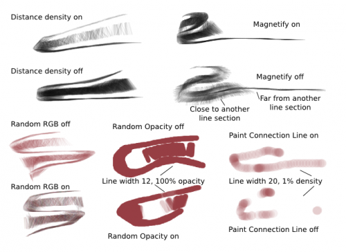
Basically, the options with effects that are actually visible are Distance density, Magnetify a-nd Random RGB. You can ignore the rest. You also have:
- Simple Mode: this mode exists for performance reasons, and doesn't affect the output in a visible way. Check this for large brushes or thick lines for faster rendering.
Finally, there's a dynamic option called Airbrush mode. This allows you to make the line curves more opaque by pausing the mouse in an area. The effect is subtle:

Use cases
You can use the sketch brush to create a variety of traditional media like effects: pencil, pen, marker, ink painting. You can use this to produce stand-alone sketches, or add shading to existing painting.
Let's start with pencil-sketching:
- You can get various effects by controlling the way you are drawing (zig-zag, circles...)
- Start by defining shapes, then add an extra layer of shading.
- Setting Offset to 0% or 100% will cause curve lines to touch connection lines exactly, resulting in web effects
- If you want a furry effect, set Offset to over 100%, and/or uncheck Magnetify. Maximum furry effect is achieved with 200% offset and unchecking Magnetify.
- "Erase" using the sketch brush itself, not an eraser brush. This will result in a more natural effect. Don't hesitate to "sculpt" forms by alternatively drawing and erasing:
- Toggle between foreground and background color using the X button if you're drawing on the background layer (set the background color accordingly)
- Toggle between drawing and erase modes using the E button on transparent layers
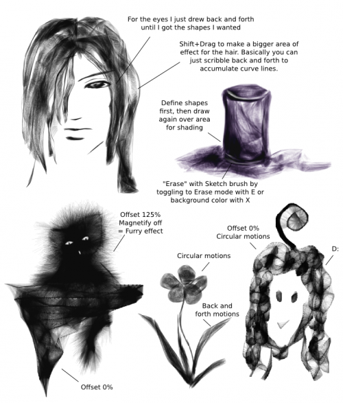
Apart from pencil-like shading, you can get other effects:
- Pen: change opacity to 100%. Yeah, that's it.
- Black marker: opacity to 100%, and Line Width to 5 or more.
- Setting the Offset to 0% in this mode will allow you to paint filled-out shapes.
- Color ink paint: Opacity at 30% or less, and a thick line width of 10 for example.
- Set Line Width to Pressure (if you have a tablet) or Speed (with a mouse) so you can draw thinner lines in this mode.
- If you're using a color other than Black, you could turn on Random RGB for some color effects.
- Changing the mode to "Multiply" works very well here too.
- If the brush is slowing down, turn on "Simple Mode" for a small performance boost.
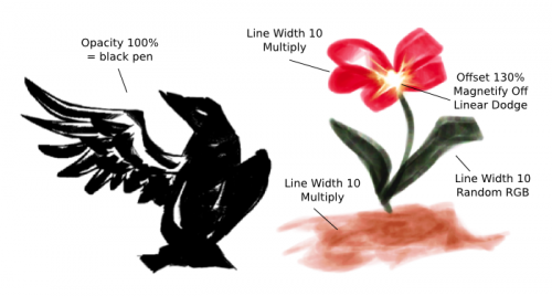
That's it for the Sketch brush!
Hairy Brush
This brush works best with a graphics tablet, but since my tutorials are mouse-only, I can't really describe all the effects. The Hairy brush is made up of a number of independent "bristles." When you use a graphics tablet, it will use the pressure setting to determine which bristles are touching the canvas, and only the ones touching the canvas are drawn. Each bristle can even take on different colors.
LukasT also has some info.
Brush tip
Simply put:
- The brush tip defines the areas with bristles in them.
- Lower opacity areas have lower-opacity bristles. With this brush, this may give the illusion that lower-opacity areas have fewer bristles.
- The Size and Rotation dynamics affect the brush tip, not the bristles.
You can:
- Use different shapes for different effects. Be aware that complex brush shapes will draw more slowly though, while the effects aren't always visible (since in the end, you're passing over an area with a certain number of bristles).
- To decrease bristle density, you can also just use an autobrush and decrease the brush tip's density, or increase its randomness.

Bristle options
You have access to the following options:
- Scale: Think of it as pressing down on a brush to make the bristles further apart.
- Larger values basically give you larger brushes and larger bristle spacing. For example, a value of 4 will multiply your base brush size by 4, but the bristles will be 4 times more spaced apart.
- Use smaller values if you want a "dense" brush, i.e. you don't want to see so many bristles within the center.
- Negative values have the same effect as corresponding positive values: -1.00 will look like 1.00, etc.
- Random offset: This controls the offset effect of bristles.
- At 0.00, all the bristles basically remain completely parallel.
- At other values, the bristles are offset randomly. Large values will increase the brush size a bit because of the bristles spreading around, but not by much.
- Negative values have the same effect as corresponding positive values.
- Shear: Shear introduces an angle to your brush, as though you're drawing with an oval brush (or the side of a round brush).
- Density: This controls the density of bristles. Scale takes a number of bristles and expands or compresses them into a denser area, whereas density takes a fixed area and determines the number of bristles in it. See the difference?
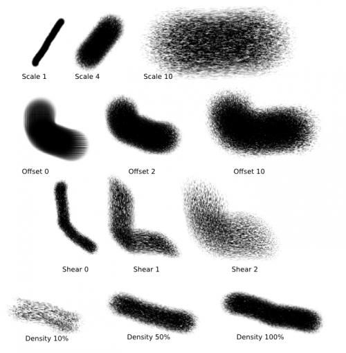
You have a number of options besides this:
- Mouse pressure: This one maps "Scale" to mouse speed, thus simulating presure with a graphics tablet!
- Rather, it uses the "distance between two events" to determine scale. Faster drawing, larger distances.
- This doesn't influence the "pressure" input for anything else (size, opacity, rotation etc.) so you still have to map those independently to something else.
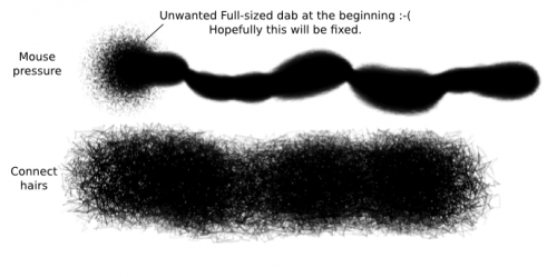
- Unfortunately, this feature has a bug: it makes a full-size dab at the beginning of the brush stroke. I've reported this bug so hopefully it will be fixed.
- Threshold: This is a tablet feature. When you turn this on, only bristles that are able to "touch the canvas" will be painted.
- Connect hairs: The bristles get connected. See for yourself.
- Anti-aliasing: This causes... anti-aliasing. The difference isn't very visible though.
- Composite bristles: LukasT explained that this "composes the bristle colors within one dab," but explains that the effect is "probably subtle."
Ink Depletion tab
The first thing you'll notice is the Ink Amount to the right. With Ink Depletion checked:
- Checking Opacity will have your brush stroke fade in Opacity after a certain distance
- Checking Saturation will have your brush stroke fade in Saturation after a certain distance
- In both cases this distance is determined by the Ink Amount

At the bottom, you also have something called Weighted saturation. Weighted saturation changes the saturation bristle colors according some weights:
- Pressure Weight
- Bristle Length Weight
- Bristle Ink Amount Weight
- Ink Depletion Curve Weight
These aren't quite visible with a mouse, and I'm not too sure how useful this is.
What's more interesting though is the last option at the top-right: Soak ink.
You don't need to have Ink Depletion checked to activate this option, you just have to check Soak Ink. What this does is cause the bristles of the brush to take on the colors of the first area they touch. Since the Hairy brush is made up of independent bristles, you can basically take on several colors at the same time. Note:
- It will only take colors in the unscaled area of the brush, so if you're using a brush with 4.00 scale for example, it will only take the colors in the 1/4 area closest to the center.
- When the source is transparent, the bristles take on a black color.
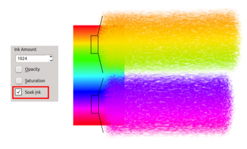
Be aware that this feature is a bit buggy though. It's Supposed to take the color from the current layer, but some buggy behavior causes it to often use the last layer you've painted on (with a non-Hairy brush?) as source. To avoid these weird behaviors, stick to just one layer, or paint something on the current active layer first with another brush (such as a Pixel brush).
Use cases
Well, I'm not sure how to explain exactly, here are a few settings instead:
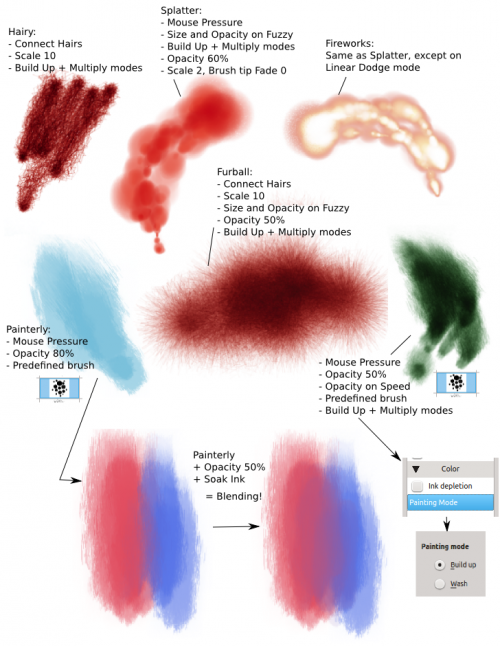
Notice that I often use this brush with Painting Mode -> Build Up (shown here) and Multiply Mode (top bar). This combination basically allows the brush to take on more "depth." Just remember to reduce the opacity. Various effects can also be obtained by setting Size and Opacity to Fuzzy.
You can also make use of the Soak Ink feature to get a sort of blending brush, as shown in the last example.
Chalk Brush
Apparently, the Hairy brush is derived from this brush. Now, all of Krita's brushes have a great variety of uses, so you must have tried out the Chalk brush and wondered what it is for. Is it nothing but a pixel brush with opacity and saturation fade options?
In the end I asked the developers, and they explained that in fact, this brush uses a different algorithm than the Pixel Brush, and they left it in here as a simple demonstration of the capabilities of Krita's brush engines.
So there you go, this brush is here for algorithmic demonstration purposes. Don't lose sleep because you can't figure out what it's for, it Really doesn't do much. For the sake of description, here's what it does:

Yeah, that's it, a round brush with some chalky texture, and the option to fade in opacity and saturation. That's it.
