Showfoto/Levels Adjust: Difference between revisions
Added category statements |
m added BreadCrumbs |
||
| (6 intermediate revisions by 4 users not shown) | |||
| Line 1: | Line 1: | ||
==Photo KDE Tutorial 1-1 - Levels Adjust== | <languages /> | ||
<translate> | |||
{{GrafBreadCrumbs|1=Showfoto|2=Levels Adjust}} | |||
==Photo KDE Tutorial 1-1 - Levels Adjust== <!--T:1--> | |||
''Unai Garro (uga) - Summer 2008'' | ''Unai Garro (uga) - Summer 2008'' | ||
<!--T:2--> | |||
{{Note|The original image used in this tutorial [http://userbase.kde.org/File:Levels_adjust.JPG can be found here].}} | |||
<!--T:3--> | |||
This is possibly one of the most widely used and most simple method to adjust an image. It's so simple and effective that you will want to use it on all your pictures from now on, so keep an eye on this, and have fun. | This is possibly one of the most widely used and most simple method to adjust an image. It's so simple and effective that you will want to use it on all your pictures from now on, so keep an eye on this, and have fun. | ||
<!--T:4--> | |||
Lets see this sample photo from Akademy 2008, kindly donated by Sebastian Kügler: | Lets see this sample photo from Akademy 2008, kindly donated by Sebastian Kügler: | ||
{| | <!--T:5--> | ||
{|class="tablecenter" style="border:1px solid darkgray;" | |||
|[[Image:PhotoTut1_1.png|550px]] | |[[Image:PhotoTut1_1.png|550px]] | ||
|} | |} | ||
You'll clearly see, the photo is darkish. After all, it was taken during a presentation and possibly the room was pretty dark. But that's no excuse for a bad photo | <!--T:6--> | ||
You'll clearly see, the photo is darkish. After all, it was taken during a presentation and possibly the room was pretty dark. But that's no excuse for a bad photo [[Image:Face-smile.png|12px]] | |||
Why is it dark? Lets open the photo in | <!--T:7--> | ||
Why is it dark? Lets open the photo in '''Showfoto''' ('''Digikam''''s editor) and see what's going on: | |||
{| | <!--T:8--> | ||
{|class="tablecenter" style="border:1px solid darkgray;" | |||
|[[Image:PhotoTut1_2.png|550px]] | |[[Image:PhotoTut1_2.png|550px]] | ||
|} | |} | ||
On the top right, you can see the image's histogram. (I have pushed the | <!--T:9--> | ||
So | On the top right, you can see the image's ''histogram''. (I have pushed the <menuchoice>Linear</menuchoice> histogram button to see it more clearly). | ||
So "What's the histogram?", you'll, ask. The histogram is just a pixel count. It counts how many pixels there are for each gray level, and shows them in a graph. The left part of the histogram are dark/black colors, and the right part of the histogram are brightest colors. | |||
<!--T:10--> | |||
You can see that our image has the histogram concentrated on the left part. Thus, it's mostly black. The right part of the histogram isn't used at all, as shown in the figure. Why did this happen? Just because the camera failed exposing the image properly, or was inappropriately configured. | You can see that our image has the histogram concentrated on the left part. Thus, it's mostly black. The right part of the histogram isn't used at all, as shown in the figure. Why did this happen? Just because the camera failed exposing the image properly, or was inappropriately configured. | ||
<!--T:11--> | |||
If a photo is visually pleasing, usually (not always), it covers most of the histogram, from black, to white. | If a photo is visually pleasing, usually (not always), it covers most of the histogram, from black, to white. | ||
So, is there a way to fix this, then? Of course there is, and it's a very easy one. Select the menu | <!--T:12--> | ||
So, is there a way to fix this, then? Of course there is, and it's a very easy one. Select the menu <menuchoice>Color -> Levels Adjust</menuchoice>: | |||
{| | <!--T:13--> | ||
{|class="tablecenter" style="border:1px solid darkgray;" | |||
|[[Image:PhotoTut1_3.png|470px]] | |[[Image:PhotoTut1_3.png|470px]] | ||
|} | |} | ||
You will see a new popup showing a tool to adjust the histogram output. There are several parts in it. On the top right, there are two histograms. The first one is the output/new histogram, and the second (bottom) one is the input/original histogram. | <!--T:14--> | ||
You will see a new popup showing a tool to adjust the histogram output. There are several parts in it. On the top right, there are two histograms. The first one is the ''output/new'' histogram, and the second (bottom) one is the ''input/original'' histogram. | |||
{| | <!--T:15--> | ||
{|class="tablecenter" style="border:1px solid darkgray;" | |||
|[[Image:PhotoTut1_4.png|550px]] | |[[Image:PhotoTut1_4.png|550px]] | ||
|} | |} | ||
As you can see, I have adjusted the output histogram to cover it all, see? So how have I done this | <!--T:16--> | ||
As you can see, I have adjusted the output histogram to cover it all, see? So how have I done this? Very simple: | |||
<!--T:17--> | |||
There are 4 sliders in this tool. The first two sliders (top bar, "Input Levels") mark the upper and lower values of the histogram that I am interested in. I have moved them to match the full histogram of our original image. | |||
<!--T:18--> | |||
The other two sliders (bottom bar, "Output") mark the range of the histogram we want as output. We want the histogram to cover from black to white, so just move the sliders to the left corner and to the right corner. | |||
The | <!--T:22--> | ||
Beneath each bar are controls that can be used to manually enter values for the upper and lower values. The keyboard or up and down arrows can be used. This allows for finer-grained control over using the sliders. | |||
Press | <!--T:19--> | ||
Press <menuchoice>OK</menuchoice>, et voilà, your nice photo is fixed. Congrats [[Image:Face-smile.png|12px]] | |||
{| | <!--T:20--> | ||
{|class="tablecenter" style="border:1px solid darkgray;" | |||
|[[Image:PhotoTut1_5.jpg|550px]] | |[[Image:PhotoTut1_5.jpg|550px]] | ||
|} | |} | ||
<!--T:21--> | |||
[[Category:Home_and_Hobby]] | [[Category:Home_and_Hobby]] | ||
[[Category:Photography]] | [[Category:Photography]] | ||
[[Category:Tutorials]] | [[Category:Tutorials]] | ||
</translate> | |||
Latest revision as of 18:20, 1 November 2020
Home » Applications » Graphics » Showfoto » Levels Adjust
Photo KDE Tutorial 1-1 - Levels Adjust
Unai Garro (uga) - Summer 2008
This is possibly one of the most widely used and most simple method to adjust an image. It's so simple and effective that you will want to use it on all your pictures from now on, so keep an eye on this, and have fun.
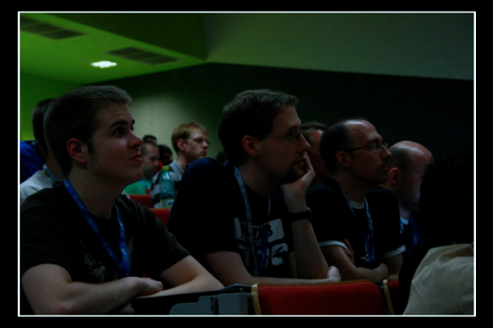
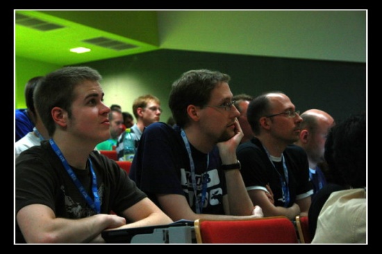
Lets see this sample photo from Akademy 2008, kindly donated by Sebastian Kügler:
|
You'll clearly see, the photo is darkish. After all, it was taken during a presentation and possibly the room was pretty dark. But that's no excuse for a bad photo ![]()
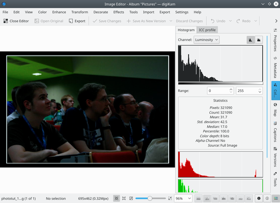
Why is it dark? Lets open the photo in Showfoto (Digikam's editor) and see what's going on:
|
On the top right, you can see the image's histogram. (I have pushed the histogram button to see it more clearly). So "What's the histogram?", you'll, ask. The histogram is just a pixel count. It counts how many pixels there are for each gray level, and shows them in a graph. The left part of the histogram are dark/black colors, and the right part of the histogram are brightest colors.
You can see that our image has the histogram concentrated on the left part. Thus, it's mostly black. The right part of the histogram isn't used at all, as shown in the figure. Why did this happen? Just because the camera failed exposing the image properly, or was inappropriately configured.
If a photo is visually pleasing, usually (not always), it covers most of the histogram, from black, to white.
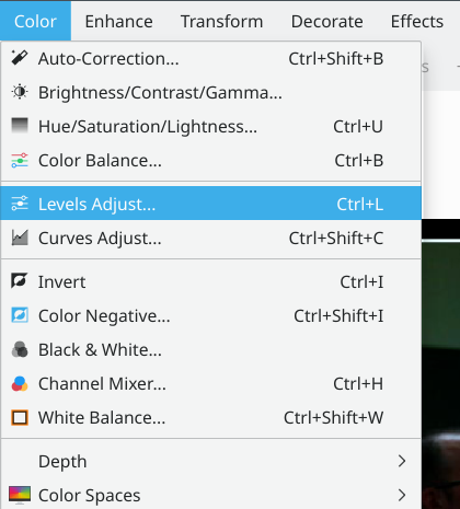
So, is there a way to fix this, then? Of course there is, and it's a very easy one. Select the menu :
|
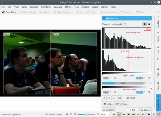
You will see a new popup showing a tool to adjust the histogram output. There are several parts in it. On the top right, there are two histograms. The first one is the output/new histogram, and the second (bottom) one is the input/original histogram.
|
As you can see, I have adjusted the output histogram to cover it all, see? So how have I done this? Very simple:
There are 4 sliders in this tool. The first two sliders (top bar, "Input Levels") mark the upper and lower values of the histogram that I am interested in. I have moved them to match the full histogram of our original image.
The other two sliders (bottom bar, "Output") mark the range of the histogram we want as output. We want the histogram to cover from black to white, so just move the sliders to the left corner and to the right corner.
Beneath each bar are controls that can be used to manually enter values for the upper and lower values. The keyboard or up and down arrows can be used. This allows for finer-grained control over using the sliders.
Press , et voilà, your nice photo is fixed. Congrats ![]()
|

